Article
Web Design for Tech Companies: Key Principles for Market Success

November 9, 2022 ...

Websites have dozens of purposes, from showcasing brands to e-commerce, creative portfolios, and creating buzz around entertainment news, media, and the latest tech innovations. These are just a few of the dozens of website categories, but they’re equally impacted by a common factor: high-quality web design.
Regardless of your category, to make your website excel in the crowded online space, you need website design that captures your audience’s attention, is accessible across device types and browsers and meets your site visitors’ needs. Certain principles apply to numerous categories and can help you accomplish the aforementioned goals, but we believe that website design necessitates customization for the client, brand, or organization in question.
In this article, we’ll explore essential website design features tech companies should incorporate, best practices for creating a high-quality website experience, and some examples of our work for different tech companies that showcase what we’re advocating for.
So what do we mean by “tech”?
“Tech” is a broad term, but in this article––with regard to tech websites––we’re referring to:
- A consulting agency’s website
- Websites for “high-tech” organizations (cutting-edge products and services)
- Microsites for Big Tech companies, product companies, etc.
- Tech-subsets like music tech, FinTech, medical tech, etc.
- …and numerous other web-accessible experiences connected to the brand of a company in the tech field
Crafting a high-quality tech website (despite tech being extremely broad) requires paying attention to what has proven to work. Adhering to established UX design principles can help streamline designing, developing, and launching a site. And while customization is to be expected (Apple isn’t Google; Fresh isn’t the same as our competitors) following a proven web design process can help you get in front of your audience faster to start generating desired results.
8 website design principles and best practices for tech companies
Adhering to website design best practices can make or break user perception of your brand. Several tech giants have set strong standards for design, like Apple’s Human Interface Guidelines and Google’s Material Design. Attention to these standards and the other elements mentioned in this section is vital when creating a high-performing tech website.
Development principles are also essential to consider. For startups and established organizations, successful technology websites are created with various programming languages and styling tools like XML, HTML 5, back-end PHP, and many others.
“Web design and development” is a package of processes, tools, and techniques for creating tech websites across various industries. In this section, we’ll review a non-exhaustive list of things your team should consider at a minimum.
Understand your audience
Understanding your target audience is important when establishing your brand’s image at large and your unique competitive market differentiation. But audience perception should also be considered when designing the many elements of your website.
The beginning of a project is a vital time to brainstorm with stakeholders, production teams, and real-world users to prioritize the essential elements. With a nuanced understanding of your audience, you’ll have critical insights about what content is most important to them. This impacts how the navigation is organized, how marketing messages are tailored, and where CTAs (calls-to-action) are placed. Finalized design elements should reflect your findings about users––a website without active, engaged traffic doesn’t serve its purpose.
Design a mobile-friendly user interface
According to Statista, “Mobile accounts for approximately half of web traffic worldwide.” A 2021 Pew Research study found that 85% of Americans have a smartphone. The evidence is clear: mobile device use is prominent, and many users access the internet primarily from mobile devices. It makes sense. Mobile devices (smartphones, tablets, etc.) are convenient tools for obtaining information and engaging with tech brands on the go.
A website that doesn’t leverage good responsive design––designs that scale seamlessly across device types and screen sizes––is a missed opportunity to build brand authority across multiple channels and touchpoints.
Your tech website should be mobile-friendly to capture that massive audience. Responsive designs, effective use of white space, and grouping of related information on single pages are all effective means of designing mobile-friend UI.
Prioritize simple, streamlined navigation
Making it difficult to find information negatively impacts user experience. Streamlined navigation (flat, rather than deep) is one way to make it easier for visitors to find what they’re looking for and accomplish their goals. “Flat navigation” refers to fewer layers hierarchy; it’s an effective way to keep things simple.
But navigation involves more than a menu at the top of the page. One of the complexities of web development involves understanding how users consume information. Difficult-to-read fonts, clunky CSS, or ineffective white space creates more confusion in getting around individual web pages and navigating between them.
Create an interactive experience
Homepages and landing pages allow your audience to interact with your brand before buying anything or leveraging your services. But drawing them in requires much more than information architecture and strategic copy, especially given how many brands are vying for a user’s attention.
Interactive messaging systems (like chatbots), strategic CTAs, and buttons add functionality that assists users in diving deeper into your website. Motion design, UI animations, and visual effects (VFX) are common components for an interactive redesign, which is an effective approach to promoting more engagement.
Incorporate visuals, videos, and multimedia
Visuals can make or break a tech website. Apple TV’s landing page uses full-width product images, clear transitions between sections, and other practical design elements that keep prospective customers engaged and scrolling. Amazon Prime Video, a competitor, opts for a busier approach, albeit one that accomplishes their goal of showcasing how much content they offer.
Visuals and other interactive elements across various websites are incorporated via web development scripting languages like Javascript and PHP. Advanced CSS (Cascading Style Sheets) is used to “describe” documents written in HTML or XML, impacting the visually dynamic front-end website experience that users see, which is grounded by back-end architecture and information stored within a content management system.
But back to the first point: visuals can make or break a tech website. Getting the balance right is essential to capturing and keeping a user’s attention.
Boost your brand
The various touchpoints of your brand come together to tell the story of who your company is, what it does, and the benefits it provides. Without a cohesive brand image, companies risk irrelevance.
Focusing on keeping your brand consistent across all channels (including social media, another one of your “websites”) is crucial. You can achieve a consistent brand voice by auditing your experience and taking inventory of how your brand impacts users.
As you develop your tech website, spend time (if you haven’t already) defining your voice and point of view, and determine if that reflects your target audience’s expectations. Then, strategize and promote your brand’s content to create a compelling customer experience.
Include real-time support
Contextual user support is essential in web design, as are integrations and plugins offered by platforms like WordPress. Human-centered design and rigorous usability testing are effective approaches for ensuring users accomplish their goals across your various web pages, but problems will inevitably arise.
We advocate that “Design is a Process, Not a Singular Event.” Leveraging data and analytics allows you to make iterative changes to your website, but to position users for success in the interim, FAQs, customer support, and other tools for experience onboarding are essential.
Continuously monitor technical aspects and performance
Technical website integrations (and analytics) are vital. Without effective search engine optimization (SEO), your site is less likely to be seen by users who aren’t already looking for it. But SEO isn’t just about have relevant content. Other critical tasks include decreasing load times and fixing broken links, which not only decrease visitor satisfaction but also work against the Google algorithms for search engine result pages (SERPs), SEO, and user experience.
Fresh developers integrate analytics into every site they create. When used as an ongoing tool, analytics help site administrators answer key issues like which navigation elements to revise, which pages to link to, and what content matters most to users. Once your website is up and running, you’ll want to constantly monitor the technical performance of each webpage to address problems immediately.
Tech company web design inspiration
Using these best practices for web design has helped us create effective tech websites for various organizations. The following examples show the best practices in action.
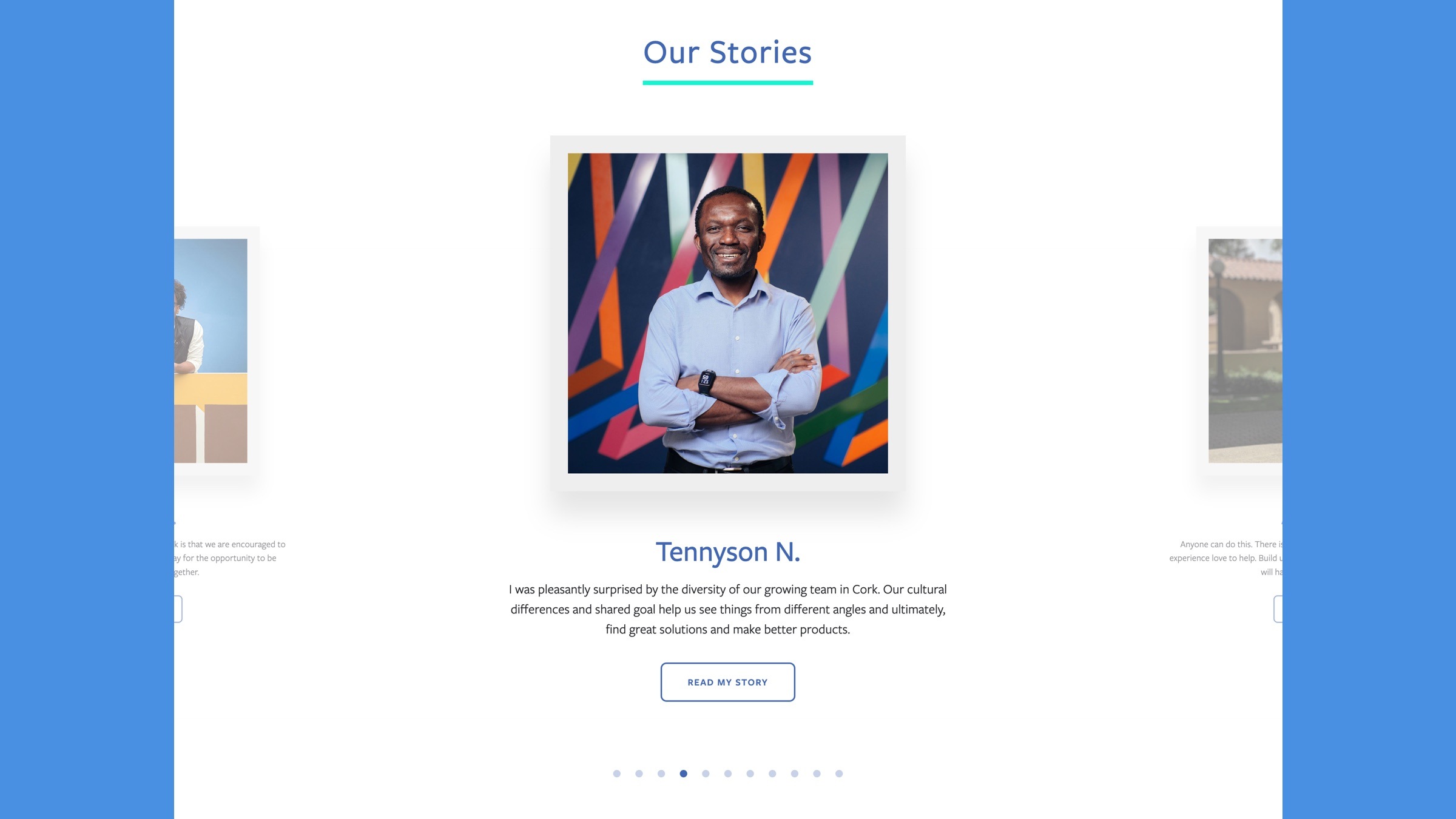
Facebook Diversity Hub: A Big Tech Microsite
Facebook approached Fresh to help design a landing page for their 2019 Diversity Report. Our team conducted research with a range of groups to gain a deep understanding of key initiatives, their target audience, and what messages were essential to communicate.
Key principles at play:
- Audience research and understanding
- Maintaining an established brand identity
- Creating a compelling human-centered story
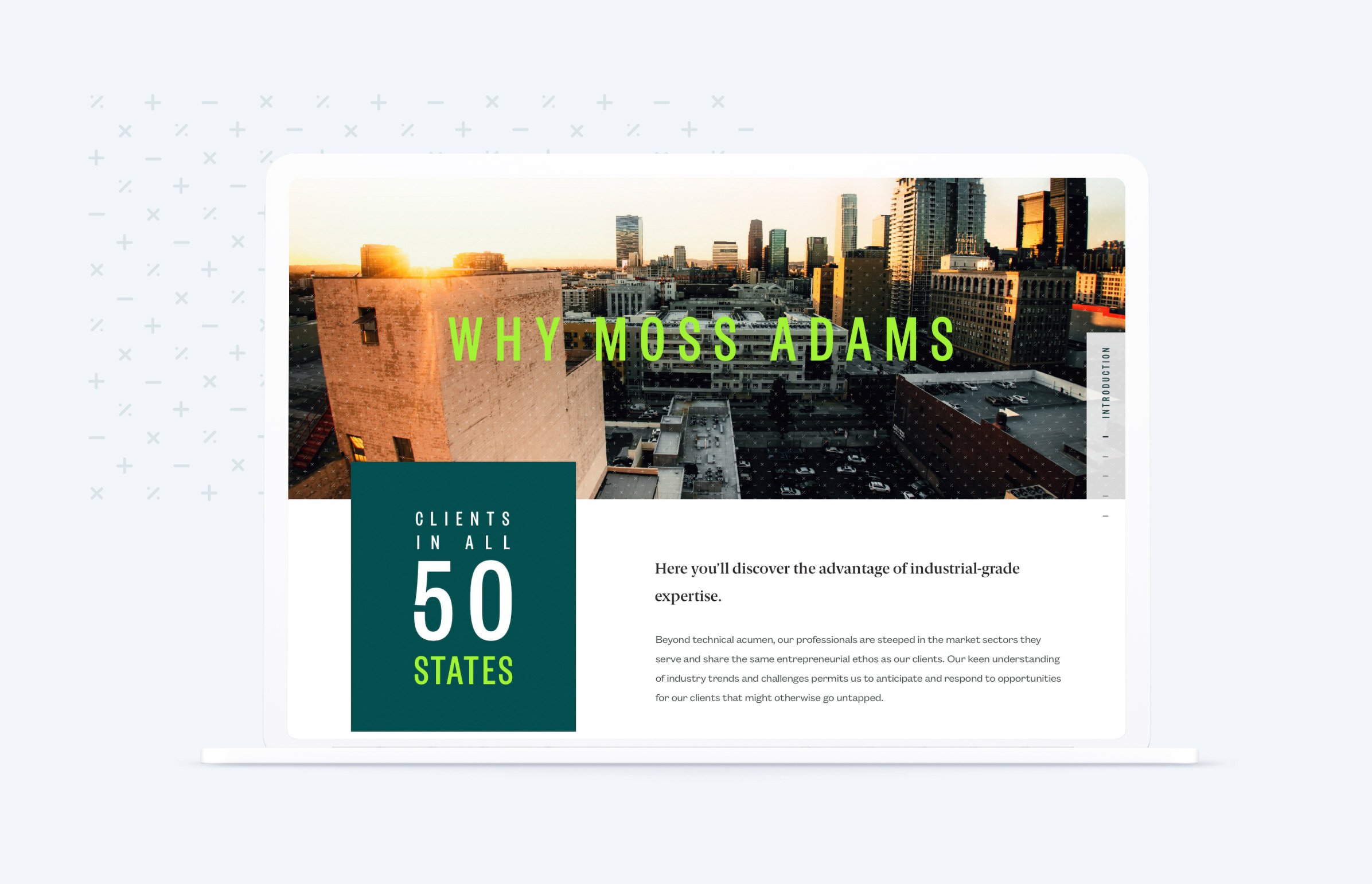
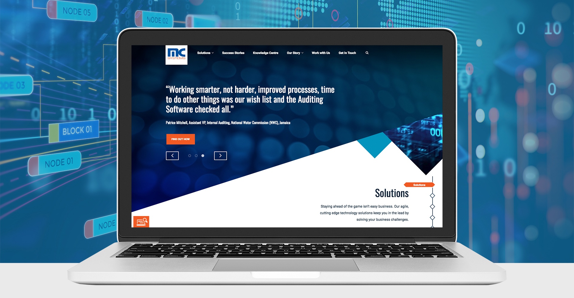
MC Systems: A Scalable FinTech Website
MC Systems had a static, outdated website that didn’t hold true to their innovative approach to FinTech enterprise technology. The Fresh team stepped in to strategize about how to promote their organizations credibility and expertise and build a homepage (and subpages) with modern aesthetics, mobile responsivity, and scalable technical architecture.
Key principles at play:
- Robust user support
- Streamlined navigation
- Analytics integrations for ongoing monitoring
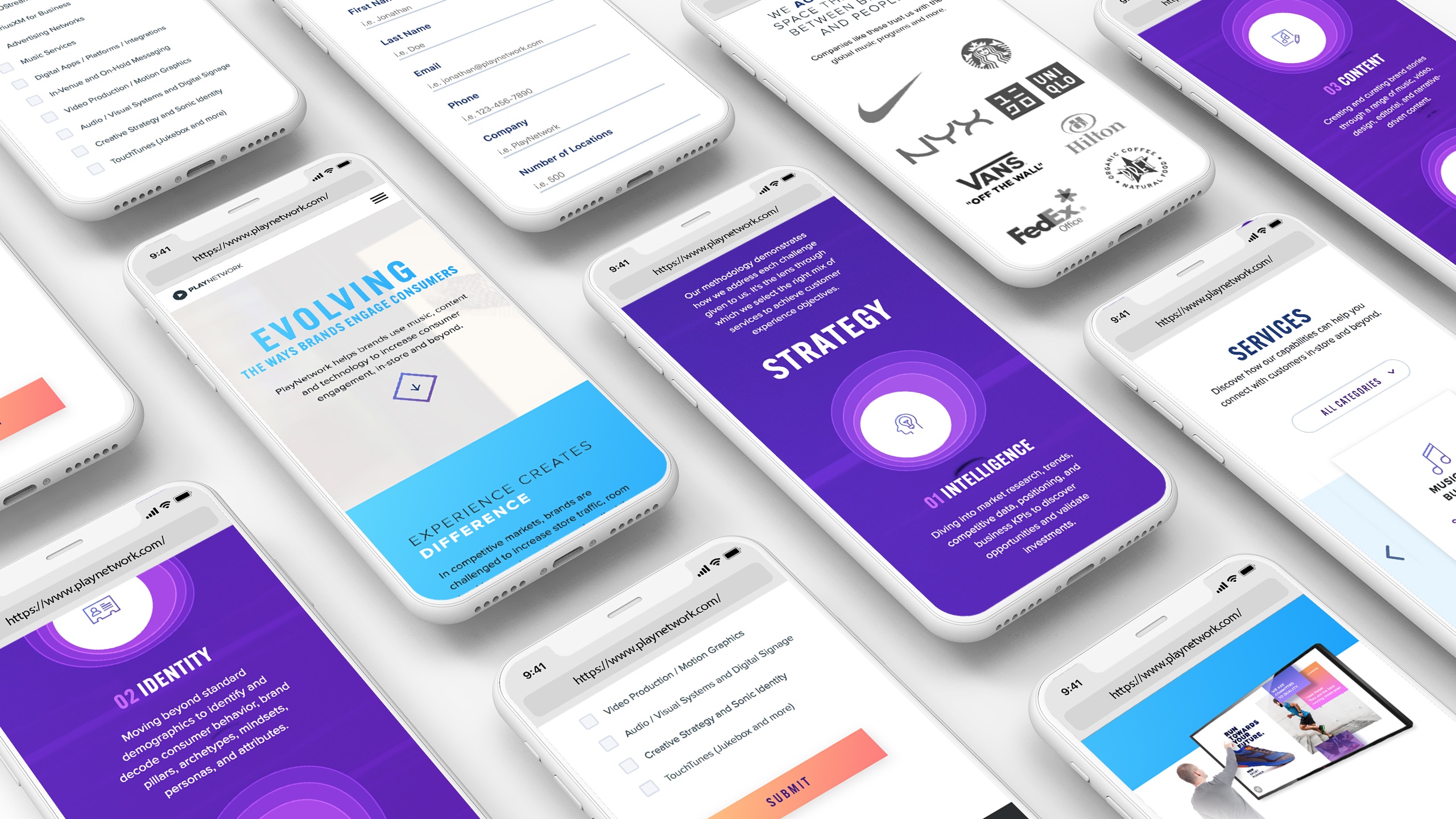
PlayNetwork: A Innovative Leader in Music Technology
PlayNetwork’s previous website was complex, hard to navigate, and failed to communicate what made them special. Fresh helped map out a comprehensive project plan to tell PlayNetwork’s story, revamp their information architecture, and update the site’s design and user interface.
Key principles at play:
- Visuals, interactivity, and multimedia integration
- Extensive content, but optimized for mobile
- Strategic paths leading users to resources and thought leadership
Need an agency to assist with your tech website? Let’s connect.
The vast number of website development platforms on the market (from something more complex like WordPress to a drag-and-drop tool like Squarespace, with various tools to aid novice designers and developers) can be difficult to parse. And rarely is a site just a static marketing page. The internet is becoming more dynamic daily, and keeping up with the competition is a tall order.
Not only is our team able to look at your unique requirements and recommend the ideal website solution, but we also have expertise with complex API integrations, myriad open-source tools, app development processes, and best practices for developing web applications.
All of these capabilities interest our clients in the tech space. With Fresh, you get an end-to-end technology innovation consultancy that can deliver anything you need––holistic support under one roof.
We would love to connect and learn more about your company, your needs, and your plans for the future!