Article
UI/UX Principle #19: Buttons Should Look Like Buttons, Links Should Look Like Links

April 7, 2016 ...

Take the Clickability Factor Seriously
In some cases, thinking and designing outside the box is a good idea. If you’re painting something abstract, try splashing an interesting color to spice up the canvas. If you’re cooking a family recipe that needs some kick, throw in a pinch of a spice you’ve never tried before.
In other cases, thinking and designing outside the box is a bad idea. Putting the windshield wiper button by the radio would frustrate car owners. Keeping the channel and volume controls just like all of the other remote buttons could make for a slick design but would ding usability. Changing the placement of keys on a keyboard could be interesting but would be an Mount Everest usability challenge. Making “Go” signs red and “Stop” signs green would kill people.
The point is, it’s important to balance convention and innovation depending on context. In many cases, it’s vital to just stick with what people are used to in the interest of helping users easily accomplish their goals. That doesn’t mean you can’t be creative. It just means that conventions can be used to guide your creativity.
The same principle holds true for web design. The world of the web is centered around clicks – mostly, clicking buttons, links, and other key features like tabs and navigation. And that’s why we have to take these micro UI features very seriously in the interest of creating a usable macro UI. The overall principle is to make things obviously clickable that are clickable. But let’s be ultra clear about buttons and links, which reside at center stage: Buttons should look like Buttons and Links should look like Links.
Buttons Should Look Like Buttons
If one outcome of using your product requires the culminating action of clicking a button, then the user has to know what it is they are supposed to click. For this reason, a button should look like a button.
A little usability testing could show you that a red button looks more like something that a user could interact with than a gray button. This is why a lot of users have complained about the trend of completely flat design. It’s the same reason why Google’s material design still allows for shadows and depth – that is, to help ensure things like buttons are known to be buttons.
In an article titled Flat Design vs. Realism: Which Side Are You On? the author writes “Last year, flat design took over the world of digital design. The hallmarks of skeuomorphic design – embossed and bevel effects, 3D artificial textures, drop shadows and reflective shimmers – all but disappeared and were replaced with minimalist design, bold colours sharp edges and lines, simple typography and very little, if any at all, shadowing.”
Flat design was a response to skeuomorphism, a design trend focused on making sure every aspect of your interfaces looks highly realistic. Although flat design has excellent qualities (color, aesthetics, innovative approaches to typography), it raises some usability concerns of its own. Often, users don’t know where to click. That’s a significant area where flat design comes up short.
Google’s material design strikes a happy medium – it borrows strong elements from both skeuomorphism and flat design. Buttons still look like buttons, and designers are afforded the opportunity to maintain a minimalist aesthetic. But the important point is that users know where to click, and the world of the web is centered around clicks.
Which one of these is a button?
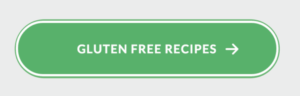
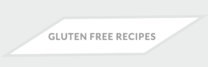
While the first option is clearly a button that takes you to gluten free recipes, the second option, although aesthetically interesting, could be misinterpreted as a tag or extraneous design element. In order to increase the clickability factor, it’s important to give your users clear indication about what they should be clicking.
Similarly, Links Should Look Like Links
In his classic book on usability, Don’t Make Me Think, Steve Krug writes “Since a large part of what people are doing on the web is looking for the next thing to click, it’s important to make it obvious what’s clickable and what’s not.”
People want to know what they can click to get from Point A to Point B. Straying from convention when links may present aesthetic benefits, but it doesn’t support usability. If someone wants to find a related article in your blog post, they’ll scour the page for something that looks like a link.
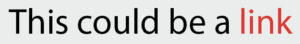
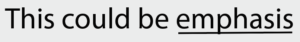
Underlining or giving a distinct color to link-text enables the user to quickly understand where to go next. The common convention is to have blue, underlined links that change color when clicked so that users can keep track of what they’ve seen. Other colors are fine also, but they should be consistent. Conversely, black underlined text may not clearly indicate that there is a link.
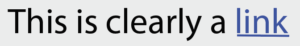
An underline and a strong color are emphatic, ensuring that links look actionable and consistent.
Which one of these is a link?
Guiding users to Accomplish Their Goals
It all comes down to making it easy for users to accomplish their goals in using your site.
Both aesthetics and usability are important. Aesthetics should even be considered an aspect of usability. But unless your website is just a non-interactive advertising spread, there’s a good chance that a user will have some goal in visiting it.
Users need to be able to easily accomplish this goal, and for that reason, using clear visual clues – that is, well defined buttons and links – is of paramount importance.