Article
UI/UX Principle #4: Responsive Design Isn’t Enough

January 5, 2016 ...
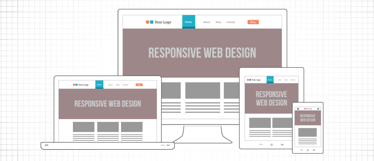
Responsive design–designing your website or app to have a fluid interface for varying device sizes–has been popular for several years now. If you’re not on the responsive design bandwagon yet, it’s likely that you’ve at least heard it’s important. But does responsive design really make a difference?
A wealth of examples demonstrates that it does. As more users move to mobile, responsive design can make a tremendous difference in conversion rates. Comscore reported in early 2015, 80% of internet users are searching from a smartphone, 47% from a tablet, and a growing number are searching from wearables like smart watches (9%) and wristbands (7%). Not only that, but 57% of consumers are “multiscreening,” or accessing retail sites on multiple mobile points and/or desktop, which generates even more demand for consistent experiences.
Problem Areas in Executing Good Responsive Design
Content Out of Proportion: Many design companies, including ourselves originally, began designing websites to be responsive just to say they were responsive, but the size of images and text were sometimes grossly out of proportion.
Simply shifting all content into the new devices’ screens doesn’t always make sense.
For example, on a desktop screen, you may have have a lot of content that doesn’t flow to mobile experiences well. Imagine a single desktop screen with 20 images that flows down to 10 mobile screens with two images per single screen. The first problem is downsizing from one screen to 10 screens might not be a good experience for mobile users…and the content may not be important enough to justify 10 screen swipes.
Rather, you may want to:
- have a single image slideshow
- show only some of the images
- scale the images to fit more than one in a grid row
Building to Grid vs. Building to Experience: While a responsive grid like Bootstrap or Foundation can make it easier to build a responsive website, snapping content into a responsive grid does not mean you’ll end up with a good experience. It only means that the design passes a Mobile-Friendly Test, not that it guarantees a great experience for mobile users. It’s easy to forget about building great experiences at the mobile and desktop size because responsive design is faster than adaptive design and too often, the focus is solely on connecting to the grid.
Focusing Solely on Navigation: A lot of companies use a responsive grid framework and make their navigation responsive and then forget how the content reads and flows beneath the navigation for various devices.
Forgetting Large Screens: Another problem is forgetting that responsive design is for larger desktop screens also. Just as mobile devices are getting more popular, larger screens and desktops are getting more popular too. Too often, companies design experiences for mobile and do a light job for tablet, then forget the broader screen sizes that should be designed for.
Designing the Multi-Screen Experience Before Development
Instead of developers simply putting the site on a responsive grid, designers (in collaboration with developers) should be curating experiences for diverse screen sizes, thinking about:
- how the experience looks
- what content and functionality gets removed or added
- what content and functionality gets simplified
- how content is attached the grid
- how content is fluid on the grid
Naturally, you want your responsive design efforts to generate ROI, so take a look at your site on mobile, tablets, laptops, and desktop, and ask yourself: Is this a good experience?