Article
Strategies for Onboarding and Engagement: Part 1

June 7, 2019 ...

Similar to onboarding an employee at a new job – where they learn the ropes of their company’s procedures and expectations – digital onboarding is about helping a new user learn the ropes of an application. Onboarding is a broad topic that covers a variety of approaches.
It’s important to understand that whatever your goal is, user onboarding is critical in creating a successful application.
If your application launches but users don’t intuitively know how to use it, you’re immediately placed behind the curve. According to Statista, that curve is steep and competitive. There are millions of apps across Google Play and the App Store. Suffice it to say, the market for applications is filled with competition.
Smashing Magazine found that: “90% of all downloaded apps are used only once and then eventually deleted by users. People often abandon apps because of a poorly designed interface or an overall negative experience. Instead of having their problem solved by the app, people get confused trying to wade through a jungle of screens, menus and buttons.”
So, in a competitive market with millions of applications, how do you avoid being one of the 90% that users try once and delete?
Create a Positive First Impression
Users often make up their mind about whether they want to keep or delete an app within a few seconds. A high-end onboarding experience can create a positive first impression with users.
Too often, the emphasis is placed on training or teaching users how to use the application after they’ve begun handling it. At that point, you may have already lost their attention.
Managing the “churn rate” of existing uses – the measurement of the number of individuals who leave your group of users over a period of time – is useful. But tackling churn proactively by converting trial users and building long-term loyalty via a positive first impression yields far more ROI.
Bypass Disillusionment and Enlighten Users
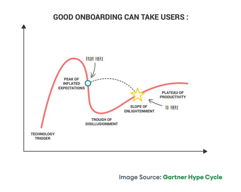
The Gartner Hype Cycle outlines the phases of a technology’s lifecycle. In the stretch of product use from inflated expectations (generally held by early adopters) to the trough of disillusionment (realizing that the value proposition fails to deliver), users can be lost. Abandonment often comes after users experience high expectations and are then let down with an experience that doesn’t follow through on its promise.
So how do you bypass disillusionment all together? A great onboarding experience can also allow you to do so, helping users overcome points of frustration or disappointing functionality.
Create an Onboarding Plan to Set Your Application Apart
While onboarding might seem an added expense or an unnecessary constraint, we view it as being an integral component of a high-end user experience. Onboarding is scalable depending on your resources and unique needs. It’s not a one-size-fits-all strategy and can be scaled in light of your budget or the scope of your application.
In subsequent posts, we’ll discuss the other components of a holistic onboarding plan, shown below:
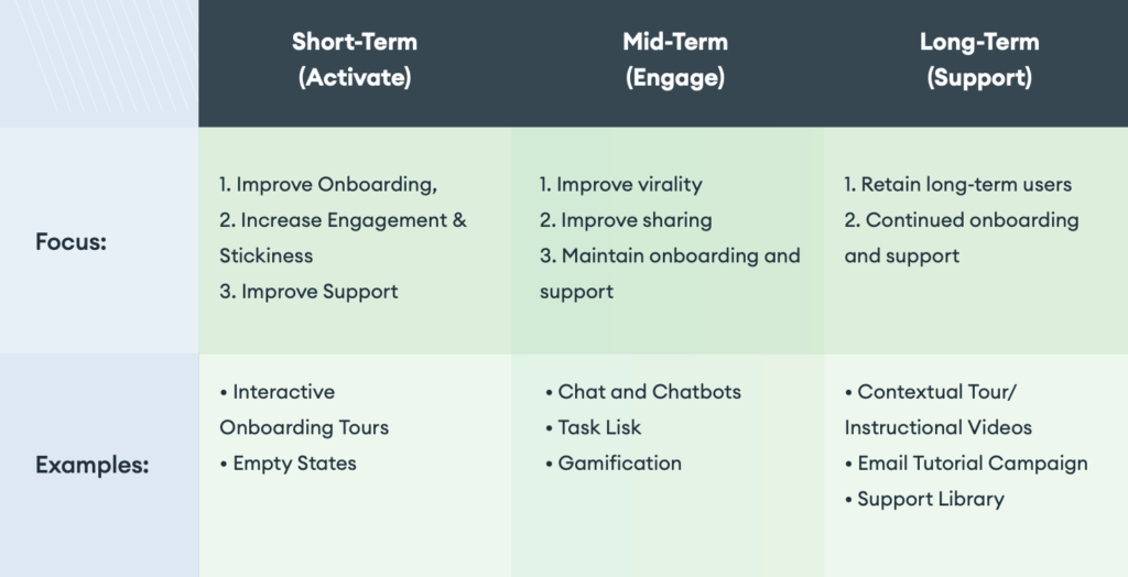
Short-Term: Activate
The Goal: In the short-term, we recommend prioritizing the activation of users. While activation starts when you begin advertising your application and users first hear about it, activation also refers to when users download your application, sign-up, and use it for the first time.
Activation looks different for different apps. For Slack, activation might mean downloading it the desktop app, signing up, and sending a message. For Pinterest, it might mean signing up online and creating a board.
You can begin engaging users as they dive into the app and complete basic onboarding workflows. By doing this, you increase product stickiness, which increases activation and thus increases your chance of converting users long-term.
Method #1: Interactive Onboarding Tour
A tour wizard is a tutorial that instructs users about what features and functionality they should be aware of. While holding the user’s hand initially, a tour wizard allows users to learn in context. This could involve filling out information or setting up a dashboard which will continue to be used after they sign-up.
To incentivize completing the entire wizard, some apps provide a percentage/completion tracker to show users how users have progressed (50%, 75%, or 100%).
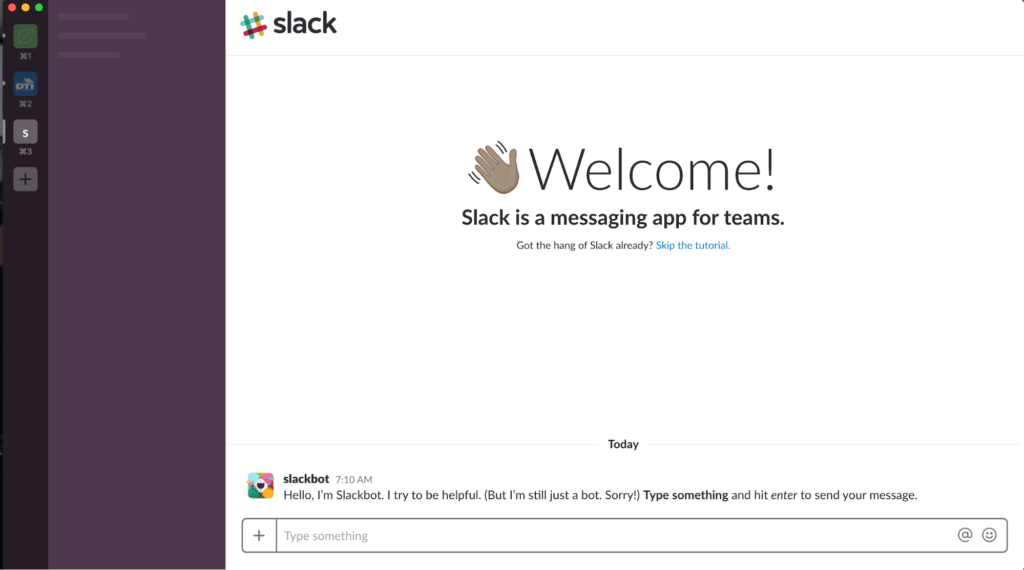
Example – Slack
A user-friendly, personable approach introduces users to Slack, with informative, conversational copy. Users have the option to skip the tutorial but are given a route to learning about functionality from the very first screen.
One component of Slack’s approach to onboarding is tooltips, which are also typically included in an Interactive Onboarding Tour.
Tooltips provide bite-sized instructions that allow users to understand basic functionality within the application, helping them to learn in context. Tooltips should provide clear headlines, informative copy, the option to skip, and the option to view another tip (if applicable).
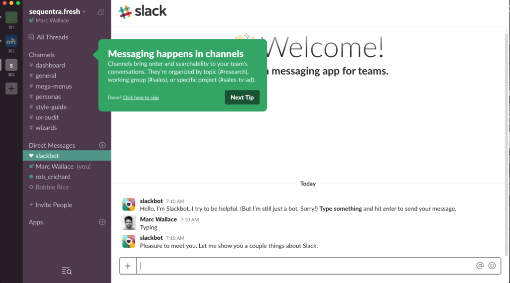
Slack utilizes tooltips – color-coded depending on the tier of navigation in the sidebar – with the option for users to bypass tips or progress to the next tip.
Method #2: Empty States
When including a dashboard or screen that users will fill with their own data, including empty states allow them to see how that will look within the application. Some applications fill empty states with the user’s data as they sign-up or enter basic information. This approach allows users to dive in and begin using the application while gradually learning important functionality. There are three steps to think about when creating Empty States.
Step #1: Educate
Show or tell the user what the screen will look like when it’s populated with data. Use tailored sample data. Showing what a partially completed or finished product looks like sets expectations and generates excitement about getting started.
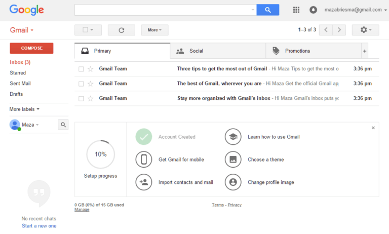
Example – Gmail
Instead of showing you an empty inbox, Gmail populates it with three emails. This educates the user about how emails will appear in their inbox – a subject, a teaser of the email content, and a time stamp. It also provides a list of steps tasks that the user can complete, which we’ll discuss more in a later method.
Step #2: Delight
Every detail you include in the empty state counts in convincing the user to give your product a fair chance. A good first impression isn’t just about usability – it’s also about personality. Can you add something fresh or unexpected? Can you make the user crack a smile, or give them a taste of the brand experience?
Example – Webflow
Webflow is a tool used for creating high-end website prototypes – gives users a clear instruction when they reach the empty dashboard: click the blue button to create a new website. Their approach is comical and provides a personal touch.
![]()
Example – Snapchat
Snapchat is a creative multimedia messaging app. In a delightful way, the app gives users a clue about how to add friends in order to populate their feed with Stories, one of the key features of the app.
![]()
Step #3: Prompt Action
A successful screen will explain a specific feature. Reiterate the value proposition of that feature and then compel you to take the next step. This is where you can motivate, persuade, and direct users to get started by signing up, installing your application, or completing another important action.
Example – Airbnb
Airbnb encourages the user to click the CTA “Start Exploring” so that they engage in the application and look for trips.
![]()
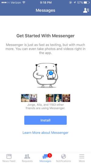
Example – Facebook Messenger
Facebook Messenger encourages users to Install the application in order to take advantage of communicating with other Facebook Users.
Interested in Learning More?
Check out our white paper Strategies for Onboarding and Engagement and stay tuned for the next two posts in this series about mid-term and long-term onboarding strategies.