Article
UI/UX Principle #26: Guide Users to Important CTAs

May 5, 2016 ...

Businesses often have an objective when a visitor lands on their website.
A CTA, or Call-to-Action, prompts site visitors to respond to that objective upon arrival.
The users could be taking the next step of engagement or converting to an end objective. For example, their action could be buying a product, downloading an ebook, signing up for a newsletter, or entering contact information in a form. CTAs are often in the form of buttons or prominent links, and they enable users and businesses to easily accomplish their respective goals.
Direct users to CTAs by focusing on three key design strategies:
- Providing clear visual guidance
- Conveying a simple, clear, value proposition
- Using action-inspiring copy
Visual Guidance Directs the User’s Attention
It’s essential for your CTAs to be eye-catching. One way to do this is through color. While red is often a default color choice given that it’s commonly associated with action or emotion, your CTA doesn’t have to be a big red button. A red button might work well in many cases, but it’s important to think about how your CTA matches your brand or design aesthetic. If your page already has a lot of red, you might capture more attention with a yellow button. Orange might fit better with your brand aesthetic. Regardless of the color you choose, it should be integrated into the user experience in a seamless way that still manages to draw the user’s attention.
Dropbox is a great example. The design of the page is simple in general. It contains a lot of white space, leaving plenty of room for visual guidance. In particular, the eye is drawn to the two “Sign up for free” CTA buttons as well as the “Try Dropbox Business” button. This is due in part to the buttons being the prominent color on the page and sharing the same recognizable color as Dropbox’s logo. Color and white space are important pieces in making Dropbox’s CTAs effective.
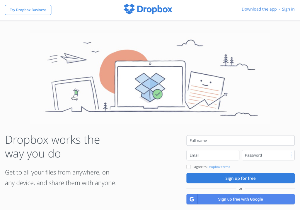
By making these effective design choices, Dropbox increases the chance of getting users to respond in an intended way. The 400 million subscribers worldwide is at least partial evidence that Dropbox’s approach is effective.
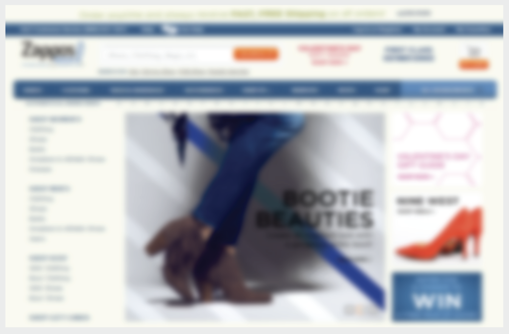
We’ve argued that usability testing is an effective way to decide if your design decisions are working. Interested in testing to see if your CTA is eye-catching? Try using a Blur Test. The Zappos Blur Test showed that attention was quickly drawn to the search function, the checkout icon, and a promotional advert. Zappos’ use of bright contrast colors paid off when it came to drawing attention to important functional areas, such as their CTAs.
The Value of Clicking a CTA Should Be Simple, Clear, and Meaningful
A CTA might look visually appealing, but why should users click it? The CTA’s value should be clearly communicated to the user. This is ensured by having strong visual hierarchy and simple, easy to understand messaging.
Take Treehouse as an example. A user might wonder why they should click Treehouse’s CTAs. Surrounding the CTA – in clear language, large type, and meaningful tone – the designers tell users why: by signing up with Treehouse, you can change your life.
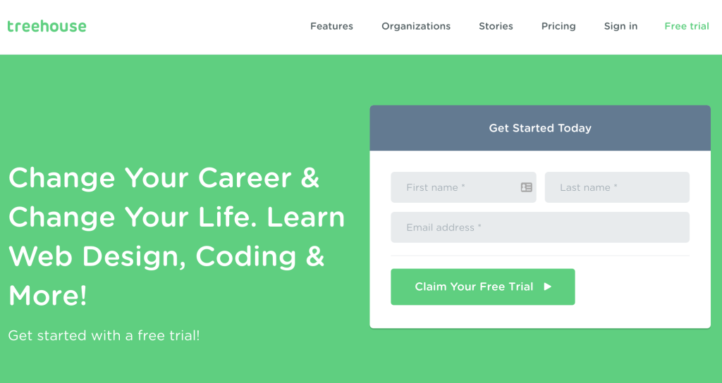
Visual hierarchy comes into play as well. It’s not enough to dish out important information haphazardly. Treehouse’s designers skillfully break up information into logical chunks that are easy on the eyes. A dark grey box, separate from the value proposition, informs users that they can “Get Started Today.” Color contrasted text fields are grouped in the same area. But they look distinct, indicating that they should also receive attention. Treehouse’s designers cap it off with a green CTA button that says users can claim a free trial.
Users aren’t forced to guess why they should sign up. They aren’t forced to figure out how to do so either. The value proposition and information hierarchy ensure that there is no hidden agenda. Treehouse makes this important information very clear up front.
Well-Written Copy Inspires Action
Visual design is essential in attracting the eye to important CTAs, but words matter as well. Your CTA needs copy that makes people want to act.
A perfect example of this is Pinterest. Pinterest wants you to sign up for their services. But what is Pinterest? What do they do? Why should you sign up? Pinterest uses a design that offers visual guidance, simplicity, and clarity. But they add to the compelling case of why users should take action with words that invite further exploration.
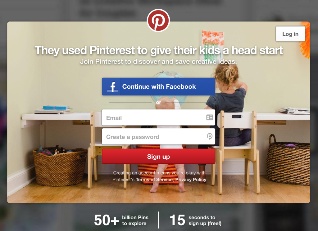
With the combination of a headline and a subheadline, the designers tell you that parents decided to use Pinterest “to give their kids a head start,” and that you can join Pinterest to “discover and save creative ideas” as well. The designers tell the user exactly how Pinterest can be used and communicate the purpose of the application with two short sentences.
In addition, Pinterest’s designers provide more important information using the power of well-written copy: there are more than 50 billion pins, in case you were interested, and it only takes 15 seconds to sign up. Best of all, it’s free!
A CTA should be short, sweet, and to the point. Well-written copy can accomplish this while also inspiring users to act. Pinterest’s CTA copy is prime example.
Use Effective CTAs to Convert Leads and Produce Results
CTAs lie at the top of the conversion funnel that turns your site visitors into business leads. The art of creating effective CTAs is not overly complicated, although there are definitely concrete guidelines. If your desired outcome is to increase conversions and produce results, then making CTAs eye-catching, clear, and compelling is imperative. We recommend the approach outlined in this post as a great starting point!