Article
UI/UX Principle #33: Scrolling is Faster than Paging

June 24, 2016 ...

Today’s websites are using much more vertical real estate.
Pages are much longer now; whereas, in the past, sites were developed with everything “above the fold.” We argue that the fold should be imagined as a concept, not a line.
While rich content above the fold draws users into the experience, it’s important to account for the fact that users desire the speed and efficiency that comes from scrolling and scanning pages – rather than clicking and waiting to view content.
“Scrolling Beats Paging” – It’s Faster and Easier
In 1997, Jakob Nielsen retracted the then standard guideline of avoiding the creation of webpages that required users to scroll.
He declared that “scrolling beats paging” because it’s faster to scroll down than to click and wait for pages to load. It boils down to the fact that one long page is often better than multiple shorter pages, each of which requires a click – and subsequent wait time – in order to access it.
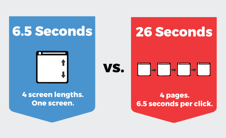
This coincides with research showing that people scan websites rather than reading them. We’re very fast at scanning pages, but web page refreshes slow us down, taking an average of 6.5 seconds. Ask yourself – “What would the users of our site rather do? Navigate to 4 different pages in 26 seconds or quickly scan a longer homepage without having to wait for a series of page refreshes?”
It’s a straightforward question with a simple answer. The growing behavior of scrolling websites – or flicking and panning on mobile and tablet devices – has further strengthened our tolerance for scrolling and our tendency to do it. This user behavior needs to be considered when we design web experiences.
As a result, Long Web Pages are Now Common
Here are 3 examples from the Awwwards, a group that recognizes and awards great websites:
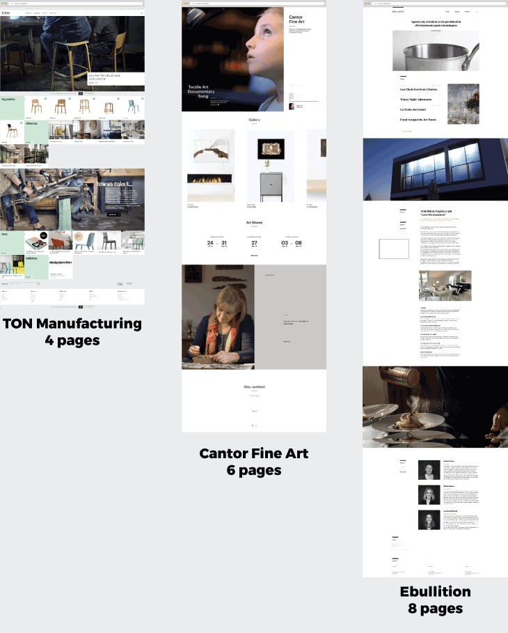
Award winning websites often take advantage of vertical real estate to tell a story. But it’s not just award winning sites that are doing this. The graph below indicates that some of the world’s largest companies have longer page lengths as well:
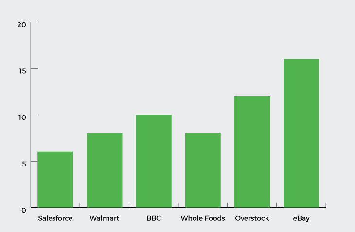
Amazon does a lot of scientific work on usability, and while the length of their Kindle page is long, they make it work. Amazon is unique; their approach as the world’s leading e-commerce site is not best practice for everyone else’s interfaces, but it is an example of how pages are getting longer. It speaks to the fact that this is an important consideration for designers.
Further Reading About Page Length and Navigation
In two other posts, we further discuss the widespread, interconnected impact of page length on navigation: UI/UX Principle #21: When and When Not To Use Tabs and UI/UX Principle #23: Flatter Navigation is Better than Deeper Navigation.
Flat navigation – which is related to the discussion of tabs – consolidates pages and makes use of vertical real estate. It decreases the layers of navigation. It also caters to the behavior of modern web users and the way that they find information. In summary, flat navigation requires less input and increases usability, and is closely tied to the practice of scrolling.
Conclusion
A quick visit to modern business websites reveals the increasing, widespread change in producing longer pages to convey an experience. There’s a noticeable movement away from introducing more pages and asking users to connect the dots. While some may consider this a fad, its proliferation worldwide points to scrolling as a user behavior that will become even more important in the future.