Article
UI/UX Principle #28: Use Succinct Copy to Focus Attention

May 14, 2016 ...
Well-designed copy is incredibly valuable in the digital space. It sells. It conveys complex ideas. And, it can make or break the user experience.
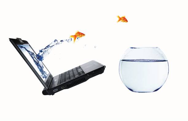
What’s more, human beings are developing increasingly short attention spans. Research indicates that they have dropped to 8 seconds – shorter than that of goldfish, creatures which are “notoriously ill-focused.”
Users visit multiple pages per day. Their attention is split between a variety of screens on a multitude of devices. The question is, how do you sell, educate, inform, and persuade effectively with copy?
Without intentionally designing your copy, like the rest of your experience, you risk users losing attention and bouncing from your site.
Highlight Your Main Message Up Front
Consider putting your main message front and center. If you bury it in the supporting details, you run the risk of obscuring it and confusing your users. Using copy to articulate your purpose lets users know why visiting your website is of value to them.
The Minto Pyramid Principle, which applies naturally to writing for the web, suggests that your thinking will be easier to grasp if you start out with the answer first.
Steven Snell advises that, “As visitors arrive at the website, they should be able to quickly and accurately understand why the website exists and what is offered, and from this they should be able to determine if it is something that interests them.”
Start with the answer – your main message – immediately. Getting the main message across faster is a critical consideration when writing for an audience with a short attention span. By removing clutter and focusing a user’s attention on the answer, the highlights of your experience are brought to the forefront.
Chunk Information, Making it Easier to Absorb
One strategy for designing the layout of your copy is “chunking.” We recommend it.
Kate Meyer writes, “In the field of user-experience design, ‘chunking’ usually refers to breaking up content into small, distinct units of information (or ‘chunks’), as opposed to presenting an undifferentiated mess of atomic information items.”
Chunked information is easier to take in. Too much information can overwhelm a user’s ability to engage in a meaningful way.
Chunking information makes it easier for users to scan. Longer pages that are divided into related pieces have a better chance of catching those short, 8 second attention spans of your users.
Write Simple and Succinct Copy to Focus Attention
How can you say things with fewer words? It’s important to consider because simple and succinct copy frees a user’s memory and focuses their attention on the central message you are conveying.
Jakob Nielsen advocates for brevity: “Be brief. If you say less, people are more likely to make the effort to understand what you do say.”
Another consideration is using less complex language. In the 25-point Website Usability Checklist, Dr. Pete advises designers to “Try to be concrete and descriptive and avoid jargon – nobody cares if you can leverage your synergies.”
Copy can make or break the user experience. If our objective is to make an experience both usable and delightful, what better way than to write in simple, succinct language that users can easily access?
Use Visuals to Support Fewer Words
Consider the following example of questionable design:
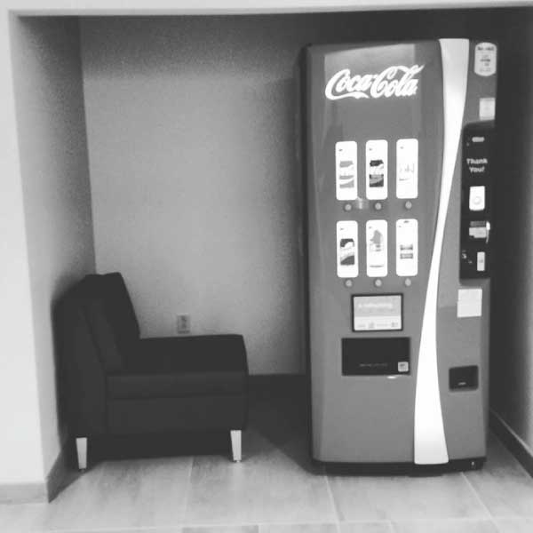
Is a multi-paragraph explanation needed about why the setup could yield a negative user experience? Sometimes you don’t need any copy. If you can make a point with a simple image or diagram – which is inherently attention grabbing – consider doing so. The goldfish of the world will appreciate you.
Example: T-Mobile’s “How Mobile Works”
In this post, we’ve advised:
- Highlighting your main message up front
- Chunking information
- Being simple and succinct
- Using an image or diagram to communicate your ideas when appropriate
Our recent project for T-Mobile, HowMobileWorks.com, is a great example. Selected screens are shown below:
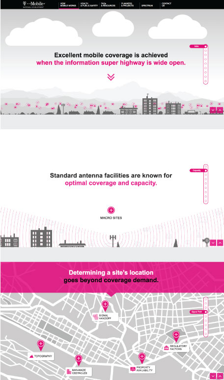
The main message is conveyed through a series of clear headlines. There’s copy on the page, but it’s chunked logically. Users aren’t forced to wade through a ton of text – rather, they can expand or collapse sections as they choose. Diagrams and imagery are used to quickly convey complex ideas. The copy focuses attention and gives users access to the other elements of the experience.
Conclusion
Like most components of UX, well-designed copy is influenced by a variety of considerations. If you can incorporate all of them, you’ll greatly increase your chance of capturing the user’s attention and selling him or her on your experience.
However, even making small changes to the way your copy is designed can improve your experience overall. The aforementioned approaches are great starting points.