Article
UI/UX Principle #47: Chunking

December 12, 2016 ...
Whether you have a website, presentation, mobile app, web application, or another user interface, the principle of chunking information is relevant.
It seems counterintuitive to break up information, but chunking leads to more focus and faster progression, ultimately leading to more comprehension end-to-end. The Nielsen-Norman group supports this when they write that “Chunking is a concept that originates from the field of cognitive psychology. UX professionals can break their text and multimedia content into smaller chunks to help users process, understand, and remember it better.”
Today, many web pages are longer due to the fact that they’ve followed the principle of chunking – creating sections of digestible information, rather than overwhelming the user’s brain with everything at once.
Examples of chunking
Talking about the technique articulates some of its value. Seeing it in action drives the point home.
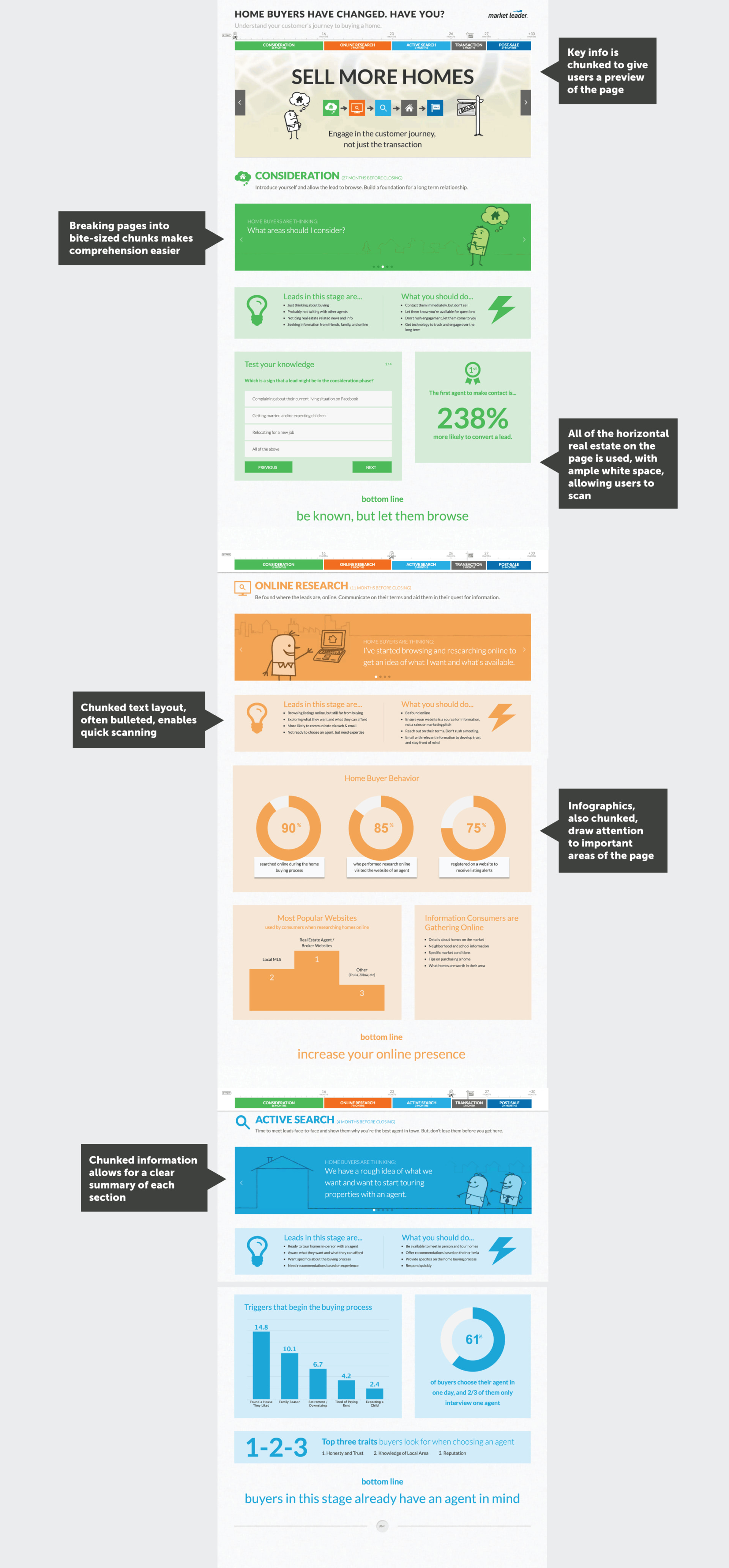
Take this website we created for the Market Leader Journey. As you can see below, we chunked information into a single page, pulling data from 100+ pages of research into an easy to understand, one page resource:
Additional examples include:
Type Form – their entire UI and product was built on this principle. The product? Fast, simple surveys requiring the user to answer one question at a time.
SlideShare – In the example below, or any other slide presentation at SlideShare, it’s easy for the user to get through a 100+ page deck. Instead of reading dozens of bullet points on a single page, the user can spend 2-3 minutes scanning a presentation that is chunked into easily comprehensible slides.
The Great State of Design with CSS Grid Layout and Friends.
It seems counterintuitive to break up information…
Doesn’t breaking things up create more length? Isn’t more length a bad idea?
If you break up some information on PowerPoint slides, you might have a lot more slides. If you break up a page of text to go on a website in clean chunks with visuals, it could be three times as long.
But chunking leads to more focus and faster progression
We argue that one of the benefits of chunking is that it can be faster to comprehend things in digestible chunks, as opposed to stuffing the user with everything at once.
Think of it like eating a meal in bites versus trying to fit it all in your mouth or force it down your throat. Which would you ask your users to do?
Which leads to more comprehension, end-to-end
One of the things we’ve learned is that as long as a web page’s navigation, layout, or content is easy to digest and comprehend, then it’s faster to build out your ideas.
That’s where chunking comes in. Starting with something small and accessible allows users to progress to other important information or parts of the site with ease.
Chunking provides more focus
A smaller number of items, concepts, and messages to absorb means more focus for users, and more absorption and comprehension.
Focus is something hard to capture these days – research shows that human attention spans have dropped to 8 seconds, shorter than those of goldfish.
The good news is that breaking up information allows the brain to focus. Combine that with white space to help the brain breathe and succinct copy that captures your users’ attention, and it creates a nice combination for focus.
The future will require more chunking
The reality is, our brains have been trained in the digital era to scan – by scrolling or flicking with our fingers – and this makes it harder to focus.
As each generation passes, as we become more accustomed to more technology and more entertainment, and develop more digital brains, design will require more chunking of information to ensure it captures interest.
Chunking is an important topic that we’ve researched and discussed extensively in our UI/UX series. Interested in more? Read these 6 posts about the how and why of chunking information:
- Flatter navigation is better than deeper navigation – Chunk information on single pages, rather than creating too many layers of navigation.
- Put related information on a single page – Use the principle of chunking to consolidate information in a user-friendly way.
- Addition by subtraction – Design simply, adding intuitive sophistication and subtracting usability roadblocks.
- Scrolling is faster than paging – Chunking can help you design scrollable pages, a much faster way of navigating information than clicking to each page separately.
- Use horizontal and vertical real estate effectively – Using page width and page length to chunk information, you can draw users more effectively into your experience.
- People scan websites, they don’t read them – 20% of content is actually read. This makes the importance of chunking information, to make it easily scannable, even more clear.