Article
UI/UX Principle #25: Use Horizontal and Vertical Real Estate Effectively

May 2, 2016 ...

Using horizontal and vertical real estate effectively is an approach to ensure that your website works well for today’s devices and viewing behaviors.
Responsive design focuses on creating one website that responds to various devices or screen sizes with a fitting interface, but using vertical real estate and horizontal real estate goes beyond responsive design.
Whereas responsive design focuses mostly on smaller screen sizes, using horizontal real estate focuses on large screen experiences. Horizontal real estate still caters to the grid systems that underpin how responsive design works, but focus on extending that grid system out appropriately for bigger monitors to maximize the use of the screen space you have.
Using vertical real estate relates to how we consume experiences on various devices, through scanning and scrolling and flicking motions. This also needs to be done in context of device to appropriately maximize its use; however, it’s about using more length to share your content or story effectively rather than break it up across pages.
By thinking about what real estate is freely available to you and getting creative with it, you can create more amazing experiences.
Horizontal Real Estate: Why and How to Make Your Experience Span Large Screens
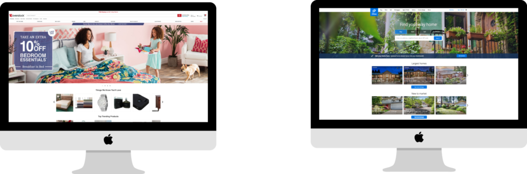
There has been a steady shift away from medium-sized screens to larger screens and huge high-resolution monitors, and to smaller screens, phones, and smartwatches. Of those different screens and devices, W3 Schools reports that 30% of web users are on high screen resolutions, many or most of which will be on larger monitors. How do we use our horizontal real estate effectively for larger devices?
Too often, we focus solely on mobile devices. We’ve seen clients with 30% of traffic coming from mobile devices, so it’s imperative to meet the users on their mobile devices with an appropriate experience, but what about the 30% with larger screens/resolutions? When moving to a smaller screen, we’re forced to make trade-offs. A video that automatically plays on a larger screen or browser window might become a static image on a smaller screen. Decisions are made to change the experience via responsive or adaptive design. But when we have more space – a 27-inch iMac screen or 30 -inch Dell Monitor or a large touch screen for example – how can we make use of that horizontal real estate? We should think about what else we can add if it can effectively be consumed.
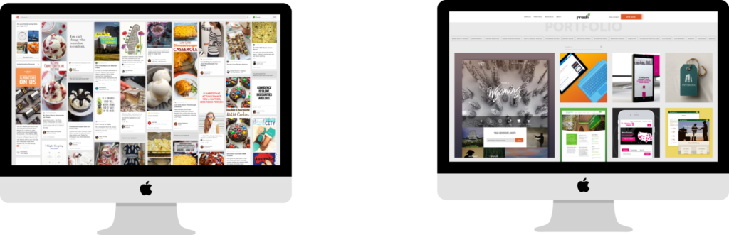
Visuals are the easiest things to expand naturally across the screen. On the other hand, text is typically read in shorter spans, and expanding your text length too much can make it harder to read (see Fresh Consulting portfolio example below). However, when you keep text content in blocks, you can use more text spread throughout the screen in readable blocks.
Horizontal real estate offers you the opportunity to expand your experience drastically. On larger devices with higher resolution, it’s important to use the horizontal real estate at your disposal to think about where and when your experience can span the entire screen. If you have a big monitor, how are you making sure that your site makes use of all those beautiful pixels? Too often, we design with a cap in mind that’s catered for smaller screens.
For example, with more real estate, why not use big, beautiful images, patterns, or colors that span its width? Fill it with more product or Portfolio pictures? Show more tiles in a collage? Let your video span the width for a full screen experience? Our eyes have panorama capability, so too can our experiences.
By taking advantage of the horizontal screen space available, and fitting your content appropriately to that real estate, you can draw more attention to your content and experience as a whole, and even add something new.
Vertical Real Estate: Free Space as Long as You Capture Interest
On smaller screen resolutions, scanning, scrolling, or flicking the device screen is a common user paradigm. This reinforces the importance of using vertical real estate. It also considers the well-known fact that we scan websites rather than read them.
In the article Life, Below 6oopx, Paddy Donnelly discusses how the concept of “above the fold” came from print journalism, and that the purpose of above the fold content – a hero image, a compelling headline, strong copy – was to engage the reader to continue exploring.
“Imagine a newspaper squashed all of its quality content on the front page,” Donnelly writes. “How disappointed would you be to open the paper to only find the leftovers? The same happens with your site. If everything of exceptional quality is pushed upon the reader at the beginning, once they start exploring and the rest of the site isn’t of the same calibre, they’re going to be let down.”
Vertical real estate encourages people to scroll. The real estate is free as long as the content is interesting, captures interest, and connects people to the rest of the experience. Rather than squashing all of your content above the fold, you can make your vertical content or storyline compelling enough that it drives people to continue scrolling.
The example below shows the different screen states from the Washington Federal site we recently re-designed. It illustrates how content organized vertically serves to advance the story. Users are invited to scroll and learn more about the company:
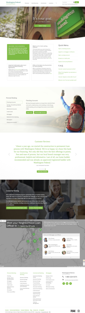
The Washington Federal page is set up to act responsively. Users get a quality experience regardless of what device or screen size they are browsing on. We still made use of horizontal real estate so that when viewed on a larger screen, the website visuals expand the available space (imagery and map and color sections).
When we think about vertical real estate, we shouldn’t be thinking about how our design choices encourage users to keep exploring? These are important considerations that relate to both horizontal and vertical real estate.
Screen Real Estate Awaits your Consideration and Investment
The examples throughout this post show how to make use of both horizontal and vertical real estate to invest in an awesome experience. Make use of all the pixels available to you can encourage users to see more content or get to the heart of the story you are telling without breaking it up across pages.