Article
UX Lessons Learned from the Hawaii Missile Alert

January 26, 2018 ...

Is there such a thing as a user error? Or when errors are made, does the blame lie with the design of the interface?
On January 13th, the state of Hawaii realized firsthand the danger of what some are calling a “user error.” If you’re a designer, and see the interface, you’ll likely agree that the primary culprit for what happened was not an individual, but rather a poorly designed user interface. Regardless, the sequence of events led to a mishap with horrifying consequences and panic for residents and tourists in the Aloha State.
Hawaii Governor David Ige sums up this cautionary tale succinctly:
“Children going down manholes, stores closing their doors to those seeking shelter and cars driving at high speeds cannot happen again.”
So, how do we – as designers and UX specialists – ensure that something like this doesn’t happen in the future?
What Led to the Crisis
“We now know that this false alarm was all because of one person who did one thing wrong.” – Ana Cabrera, CNN
“HEMA’s State Warning Point, the division responsible for sending out the alerts, had conducted 26 prior internal drills on the ballistic missile alert, [State General Joe Logan] told lawmakers. It was the 27th — sent out by a division warning officer with more than 10 years’ experience at the agency — that went awry.
“‘It wasn’t the fault of just one man in a room pushing a button. It was the entire system,’ Rep. Matt LoPresti said at the hearing.” – Honolulu Civil Beat
The blame for the Hawaii Missile Alert doesn’t lie with one person. One glance at the interface, and you can easily see what led to the user clicking the wrong option, and why anyone could have made the same mistake.
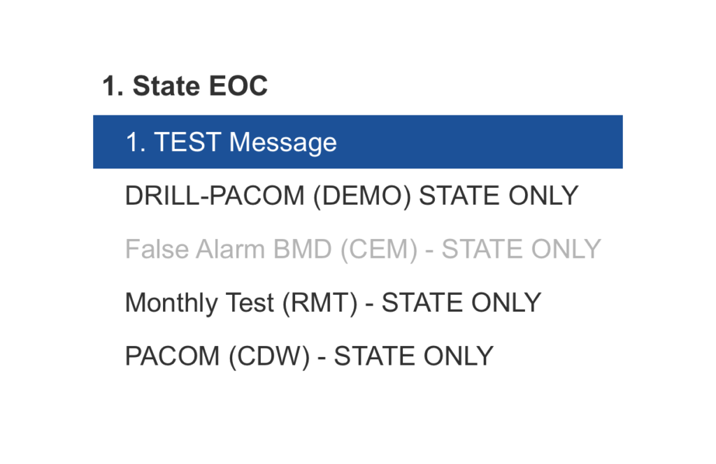
Here’s a photo of the interface that led to the false alarm. What was clicked didn’t look like a button – it actually looked like a poorly designed link:
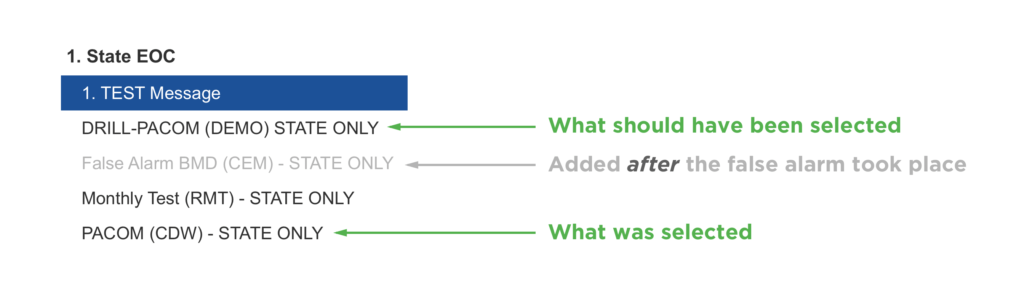
The user should have selected “DRILL – PACOM (DEMO) – STATE ONLY.” They inadvertently selected “PACOM (CDW) – STATE ONLY.” The only differentiation here, due to each option being exactly the same color, are two words: DRILL and DEMO.
Adequate visual guidance provides users with direction about what CTAs – or “Calls to Action” – should be clicked. Due to undifferentiated links, the so-called user error here is easy to understand. Add that there was poor writing and labeling involved, and it becomes even easier to see why the mistake was made. With an application as important as this messaging system, communication with the user should always be profoundly clear.
The Psychology Behind the User’s Decision
To come to terms with what might have been going through the user’s head, let’s explore a psychological principle that was at stake.
Consider Fitts’ Law. In 1954, American psychologist Paul Fitts created a law to outline the difficulty of “target selection.” Applied to Human Computer Interaction (HCI), the law “predicts that the time required to rapidly move to a target area is a function of the ratio between the distance to the target and the width of the target.”
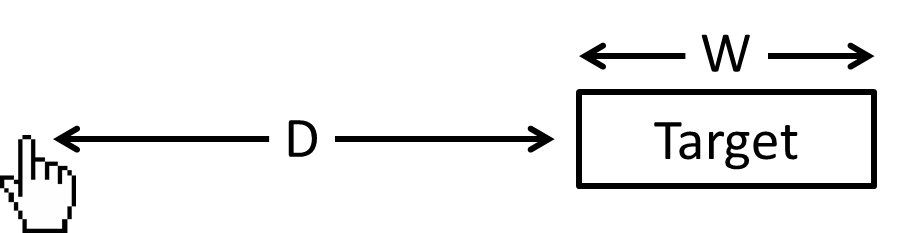
In plain English, this means that there’s difficulty inherent to clicking on the right target with your mouse. In this incident, the user clicked the option that warns citizens and tourists of Hawaii that there is an incoming missile and that it is not a drill.
The difficulty of this task correlates, in part, to the size of the clickable target (a link) and its proximity to other similar targets (other links). Looking at the photo supplied by HEMA, it’s not difficult to see how cluttered the menu options are. In this case, inadvertently clicking a link (without an option to easily undo the action) was far too easy.
Place yourself in the shoes of the user who sent out the statewide error message. You’re at the end of a long shift. You need to authorize the drill, likely within a certain amount of time. There are 4 nearly identical options you can select. Each option is virtually indistinguishable from the next.
If including four options is essential to the user’s workflow, then better visual aesthetics and spacing should be included to help the user select the right option one hundred percent of the time. Fitts’ law provides a starting point for understanding how to lay out an interface more effectively to decrease the probability of error.
How the Warning Was Communicated
Professional surfer Kelly Slater provides a photograph and explanation about how people were notified via his personal Instagram. This is the phone notification he was sent – via a “Wireless Emergency Alert System,” similar to an Amber Alert – warning of the missile threat:
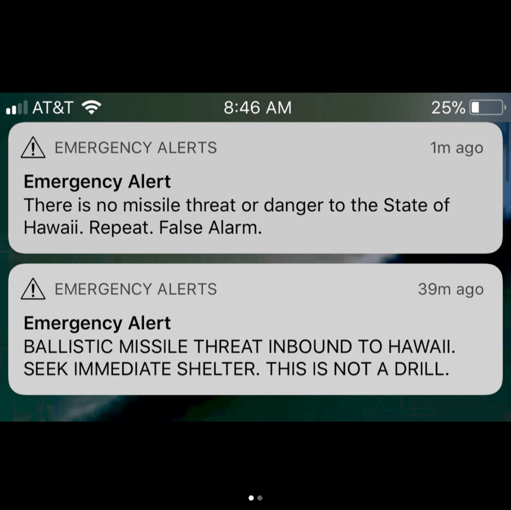
Slater writes: “What took 38 mins to correct that ‘mistake’ via follow up warning? Did a missile get launched and blown out of the sky and do we have Star Wars defense capabilities?”
On the one hand, the first Emergency Alert is effective at articulating the immediate danger of the situation. But the follow up message does little to quell the rightful fear and frustration felt by people involved in the incident. An emergency system should keep the writing and messaging succinct. It should also provide feedback in a reasonable amount of time, in a way that speaks personally to all users.
As Jacob Nielsen elaborates in his seminal 1995 post titled “10 Usability Heuristics for User Interface Design,” Visibility of system status should always be placed front and center. Nielsen writes that “The system should always keep users informed about what is going on, through appropriate feedback within reasonable time.”
However, Nielsen also writes that “Even better than good error messages is a careful design which prevents a problem from occurring in the first place. Either eliminate error-prone conditions or check for them and present users with a confirmation option before they commit to the action.”
Had the system been built to avoid error prevention, a message wouldn’t have been relayed in the first place. But needless to say, any error message should be sent in a reasonable amount of time for the system to communicate the actual nature of the situation to users, or in this case, Hawaiians and tourists.
The emotional and physical toll of the error – and the delay in correcting it – are strongly evidenced by the events that transpired.
The Importance of Content Writing (and Communicating in Plain Language)
One could argue that the person who pressed the wrong button in the Hawaii missile incident should be considered a “specialist.” He or she would likely be well-versed in the language of the application. While there’s truth to the value of training, consider the language of the interface:
There’s danger inherent to not writing interface language in plain English. Kate Meyer, a UX Specialist with the Nielsen Norman group, argues that writing in plain language is crucial. This can be true regardless of whether you’re writing for specialists or for general audiences.
Some specialists might be driven from your website or application if you define too many common terms in clear detail. However, it’s paramount – with a warning or defense system that requires deft operation – to spell options out as simply as possible.
Is DRILL – PACOM (DEMO) STATE ONLY clearly understood by the users operating the system? Perhaps. But consider that the abbreviated verbiage could be more confusing than is necessary. It’s difficult to imagine someone arguing that it’s written in “plain language.”
With a system as important as this, where an error cannot be tolerated, communicating with users in plain language is vital.
As Designers and Developers, What Can We Do?
“Over 90% of industrial accidents are blamed on human error. You know, if it was 5%, we might believe it. But when it is virtually always, shouldn’t we realize that it is something else?” – Donald Norman
In 1979, there’s the account of a nuclear meltdown at Three Mile Island in Dauphin County, Pennsylvania. It took 14 years and 1 billion dollars to clean up afterward. One glance at the control room, and it’s easy to see why, as Donald Norman put it, the control panels look as if “they were deliberately designed to cause errors.”

How do we avoid these types of situations – such as the Hawaii incident and Three Mile Island – in a world that is becoming more technologically advanced and immediately interconnected by the second?
As designers, we owe it to our users to keep usability principles at top of mind when creating interfaces. Our pie-in-the-sky goal should be eliminating the possibility of human error. There will always be some level of human fallibility involved. No one is perfect. However, we can follow UX principles to decrease the probability of mistakes being made.
There is both a financial and productivity related ROI in UX Design, but there’s also emotional ROI. As we continue creating machines, applications, and websites for our users, we owe it to them to design with usability as our key focus. In so doing, we can avoid catastrophic situations like the false missile alert in Hawaii.
“I was in my hotel room in Kaanapali when I received the missile alert message on my phone. I had just put my son down for a nap. ‘What’s this?’ I thought. I looked out the window and everything looked fine – sunny and blue skies. Not that I would have seen anything anyway, but it made me feel better. I wasn’t sure what to do; was this message real?
Then I heard that the hotel was asking everyone to evacuate. I figured I had better go at least downstairs since if there were a missile the consequences of not acting could be dire but if there were no missile it would end up being no big deal. A few minutes after having everyone go outside the hotel had everyone come back inside (‘SEEK IMMEDIATE SHELTER,’ right?).
While we were waiting, wondering what was going on, word started to come in that the alert was a false alarm. First we heard rumors that the police were saying things were fine, then the hotel made an announcement, and then finally another alert came through on our phones saying it was all a false alarm.
While we were all glad there was no real threat I almost sent a message back to our team: “Please remember to design systems such that false ballistic missile warnings will not be sent while coworkers are in Hawaii”.
– Steve Hulet, Fresh CTO