Article
UI/UX Principle #27: Think of the Fold as a Concept, Not as a Line

May 12, 2016 ...

When we talk about “the fold”, we’re talking about the upper area of a website that is immediately visible to users when it loads on their screen.
We recommend using this upper area of your web page to draw users into your experience, regardless of the screen size on which it is being viewed.
In the early days of web design, the comparison between the newspaper fold and a webpage fold made sense. The old concept was that the fold was a rigid unit of measurement. It dictated how designers organized webpage content for uniform screen sizes.
Today, the fold needs to be reimagined in response to the way people are consuming modern digital experiences. While you may have crafted an experience that responds well to a variety of device specifications and remains somewhat consistent, the physical location and appearance of compelling “front page” content will change.
Consider the Fold as a Concept Rather than a Unit of Measurement
The truth is, there’s not a common fold anymore. One user might browse from a 27‑inch iMac with a Retina 5K display. Another user might be on an Samsung Galaxy S7, with a 6-inch screen (see 2016 usage statistics about browser displays, resolutions, and device types.) The upper portion of the same website will appear differently on different screens:

But rewiring the way we think about this aspect of design is not that complicated. “Above the fold” – the upper area of the screen that is immediately visible to the user – can be designed in such a way that it draws users into the rest of your experience without limiting what you do below the fold.
Getting the User’s Attention is More Important than Front-Loading Information
Contrary to popular belief, people actually scroll. It’s smart to design longer pages. But if you don’t include all of your information above the fold, how do you ensure that users will access it?
In The Fold Manifesto, Amy Shade writes “The fold is a concept. The fold matters because what appears at the top of your page matters. Users do scroll, but only if what’s above the fold is promising enough. What is visible on the page without requiring any action is what encourages us to scroll.”
It’s important to capture the user’s attention wherever the fold lies. With compelling primary content – engaging visuals, key branding elements, attention-grabbing headlines – and clean navigation, you can ensure that they’ll engage with the rest of the experience as it unfolds below.
Ensure that Users Immediately Understand What Your Site Is and Why It’s Valuable
Moz’s Tim Allen writes, “Above the fold content needs to contain a strong value proposition that explains to the user exactly what the page can offer.”
What you place above the fold is important in your information hierarchy because it’s the first thing people see. Make sure that you give users a clear understanding of what value you are offering in context of who you are and try to spark their curiosity to take a clear next step, whether that is to scroll for more understanding or click on your clear call to action.
But this doesn’t need to be a yard sale of all your important content. Eric Huber states that dumping your important content above the fold is “the equivalent of taking everything in your store and putting it on the curb, along with painting every sales price on the doors and windows, just in case someone passing by might not come in.” Much like the purpose of the sales windows, the key is to invite them in.
Whether a user accesses your experience from a mobile phone, a modestly sized laptop screen, or a gigantic, high-resolution monitor, “the fold” should be used as a guiding principle for indicating value at the front and center of your experience.
Use the Horizontal and Vertical Real Estate at Your Disposal
Both the width and length of the page will change from device to device, so it’s crucial to use all of the space available to you to make your experience span the screen.
In a post on using horizontal and vertical real estate effectively, we wrote “Vertical real estate encourages people to scroll. The real estate is free as long as the content is interesting, captures interest, and connects people to the rest of the experience. Rather than squashing all of your content above the fold, you can make your vertical content or storyline compelling enough that it drives people to continue scrolling.”
Start with horizontal real estate. Make sure that compelling content spans across the entire screen. Vertical real estate should unveil more of the story below the fold, which users are prompted to read based on their initial judgment of the experience.
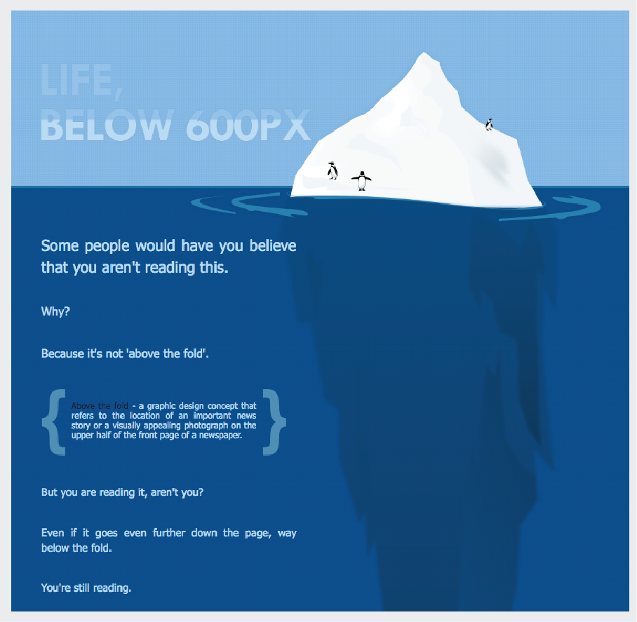
In Life Below 600px, Paddy Donnelly brings up a crucial point about how content “above the fold” is really just the tip of the iceberg. His graphic represents the point:
Given that people actually do scroll, we have to think about giving them a reason. No longer are we required to pack everything on a uniformly sized screen. The number of devices, screen sizes, and resolutions being used today necessitates being creative with vertical space.
Conclusion
Research and statistics show that the way digital experiences are consumed is changing rapidly. It stands to reason that as technology continues to advance, this trend will continue.
The fold of tomorrow will be much different than what it is today, but we can already move beyond imagining it as a limiting unit of measurement. Instead, consider the fold as a concept in capturing attention for your compelling user experience.