Article
UI/UX Principle #21: When and When Not to Use Tabs

April 14, 2016 ...

Tabs are a navigation element used in web design that allow users to easily access different areas of a site or different parts of an individual page.
They’re sort of like tabbed dividers in a filing cabinet – by clicking a tab, users can easily locate a page containing related content.
However, just because tabs exist doesn’t mean they should always be used. It’s important to use them wisely. They can be a great tool to ease navigation and group related content, but sometimes a page benefits from being tab-less.
An efficient, high-quality website needs an effectively structured navigation and tabs are certainly an option. But regardless of whether your use case necessitates including this navigation type, they are a common navigation tool, often located in both the main navigation (global level) and local navigation (individual page level).

When To Use Tabs
Tabs are intuitive due to being a commonly used convention. Use them to group content, connect related information, and as a tool to save space.
In Chapter 4 of Safari Books Online, the author writes, “Tabs are commonly used for the main navigation, vertical mechanisms on the left for local navigation—but there are no set usage rules, and many variations exist. [ . . . ] To sort them out, try thinking like a visitor, not a designer. Take time to consider how visitors perceive the navigation mechanisms. Understanding the type of navigation a menu represents can help people predict links and reorient themselves on new pages.”
Tabs are called for when:
- You need information to be highly scannable and simple to navigate. People often scan websites rather than reading them. In these cases, including tabs can aid users in locating the specific information they need
- A page could benefit from having a more organized structure. Using tabs can be efficient and lead to strong UX because the navigation scheme aligns with users’ expectations.
But tabs aren’t always called for.
A litmus test for whether or not you want to use them is to ask yourself, “If I printed out this page, would I want users to see all the information grouped together? Or would I want them to access each section separately?” If you want users to access each section separately, then using tabs is a logical choice.
When Not to Use Tabs
Space – vertical and horizontal real estate on a web page – is a powerful yet limited commodity. You want to carefully control where your users click and where your users look in order to give them the best user experience relevant to their needs. Ditch tabs whenever you need to create a unified experience. If it makes sense for information to be grouped on one long page that encourages scrolling, then going without them is best.
Skips tabs when:
- It’s more powerful to see related content grouped together. Take Amazon’s product pages, which are designed to keep users on the page, reading more about the product in question. The way the page is designed encourages users to continue scrolling to explore, whereas tabbed navigation would break up the experience.
- Content is sequential. It’s typically unwise to use tabs in customer support pages, when users need exact answers rather than topics to browse.
- Page real estate is limited. If you’re short on space, a well-designed layout of vertical sections can make better design sense.
If you’re stuck on whether or not to use tabs, ask yourself questions such as:
- Are the page sections easily scannable?
- Would it take more time for users to open a new tab than to scan the page?
Back to tabs being like dividers in a filing cabinet – if you have only one piece of paper, you don’t need a filing cabinet to keep it organized. It might make sense to include everything on a single web page. But it comes down to balancing usability and the overall design strategy.
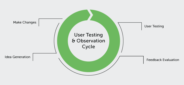
When in Doubt, Test!
As with all aspects of UX design, it’s vital to conduct usability testing. You can’t just guess what works. As we’ve argued in other posts, a little usability testing goes a long way.
Creating basic clickable prototypes early in the design stage allows you to test. If you’re deciding between the two options, you can test to:
- See how fast users can process a task with tabs vs. without them
- Ask them what they prefer
- Balance user responses against your overall design strategy, determining how to best proceed.
So You’ve Decided to Use Tabs. Now What?
If you decide to use tabs, some general design guidelines include:
- Making tabs symmetrical and interactive
- Tab organization should be logical, which is related to information architecture
- A user should be able to easily tell which tab they are on
- Effects should enhance interactivity so users know if they’ve clicked something
- Concise Copy
- Labels should be short
- Use plain language
- Include consistent typography
- Clear Interaction
- Current tabs should be highlighted
- Unselected tabs should not be highlighted
- Each tab should be clearly tied to a different content area
Tabs can be incredibly effective depending on what your website is, who your users are, and how they’re expected to interact with your site. As with all aspects of web design, there are best practices that can increase usability and enhance the user experience. But ultimately, including tabs depends on asking yourself which option makes the most sense overall.
If you’re interested in talking about a website project, don’t hesitate to reach out.