Article
UI/UX Principle #29: Color Has Meaning

May 19, 2016 ...
Color is an essential design staple for influencing the hearts and minds of your users.
It’s important to understand the meaning and psychology of color and use its meaning to establish the look, feel, and order of your experience.
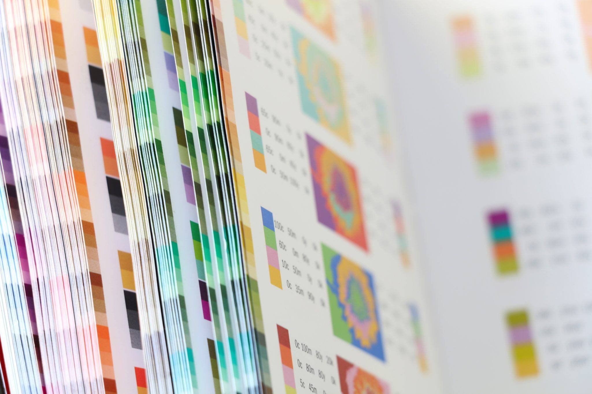
Color theory is a vast field and there are entire books written about it. Suffice it to say, it’s an important discussion with implications for design that reach beyond the scope of one blog post. However, our purpose in this principle is to remind that color decisions should not be made arbitrarily. We recommend being purposeful as you leverage the meaning of different colors to enhance your design.
Color Captures Attention
Why should users come to your website? What’s in it for them? What does engagement look like? How do you want them to interact?
These are all essential questions to answer. Whatever your answer, a key to accomplishing your purpose is the use of color.
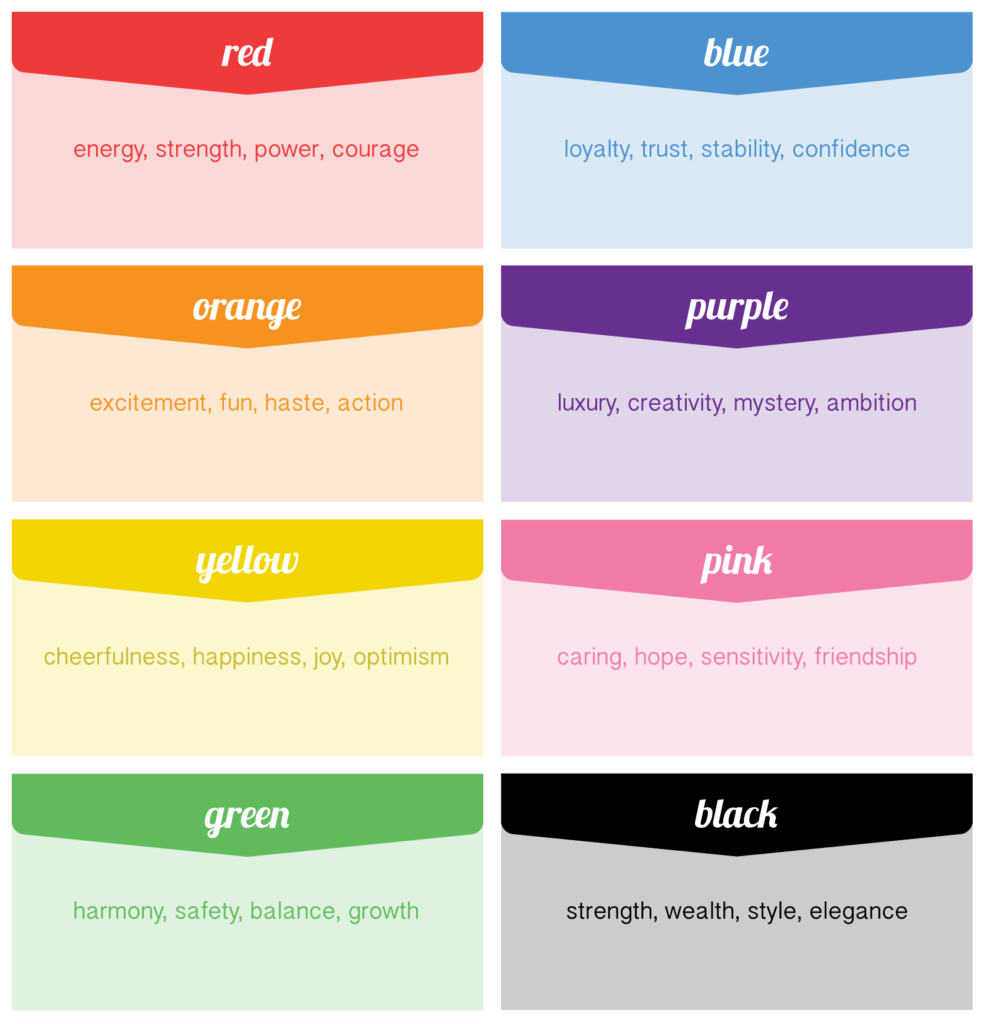
In The Smashing Book #1, the authors write “Color can focus a user’s attention and coax them into engaging with a website. [ . . . ] Your colors should pull them into the design and content. You can use color to draw their attention to the most important aspects of your website.”
One example of how color captures attention is Amazon’s use of orange to highlight products and important CTAs. Amazon’s variations of orange focus the user’s attention on key areas of the layout.
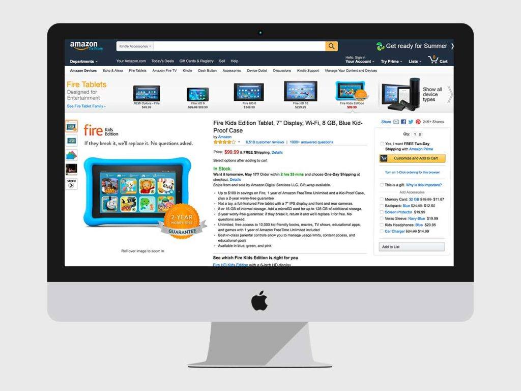
Orange implies fun, haste, impulse, and energy. It’s loud. In regard to the screen included above, the visual clues draw the user’s attention to the title, the value proposition, the positive reviews, and the ability to easily add the product to your cart with a single click.
But they don’t overwhelm us with orange. They use it strategically, in the specific places where fun, energy, impulse, activity, and haste are necessary. Amazon wants you to click, scroll, and explore. With their abundance of content, they use orange to increase the chance of you seeing the signals they don’t want you to miss.
Color Conveys Brand and Emotion
In The Smashing Book #2, the authors write “People are influenced by color in a variety of ways. Color affects us emotionally, psychologically, physically and socially.”
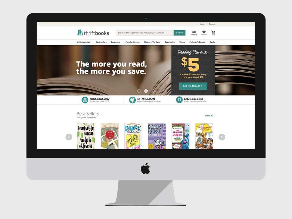
A prime example of the emotional and psychological implications of color is our collaboration with Thrift Books brand redesign. The company’s goal in redesigning their brand and website was to establish a modern look with a sense of warmth. The Thrift Books cutting edge technology operations and care for books embody this philosophy. By pairing a cool, modern aesthetic with the warmth and charm of a well-loved book, the brand colors also convey this message clearly.
Another consideration was how “thrift” could be perceived. Many of the books Thrift Books sells are in ‘Like New’ condition. All pass a quality control test. Presenting the books with a cool, modern aesthetic emphasizes the high-quality of their product. They are “nearly new” as opposed to “dusty and old.” The modern aspects of the Thrift Books brand was reinforced through the teal and white colors.
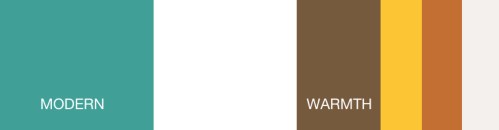
People who shop at an online bookstore want a certain kind of experience. Ultimately, the warmth and charm of reading a well-loved book in your favorite chair was a feeling we needed to recreate. These aspects of the brand are reinforced through the brown, yellow, and rust colors, also reinforcing thrift in a positive light when balanced with the modern primary colors. Bottom line, deep thinking went into the brand color psychology and meaning to reinforce the brand ethos and connect with their customers.
Color Creates Hierarchy
When coming to your website, users will have lots of questions that, if not answered quickly, may cause them to bounce. Where should they click? What should they look at first? How do they get from Point A to Point B and accomplish their goal?
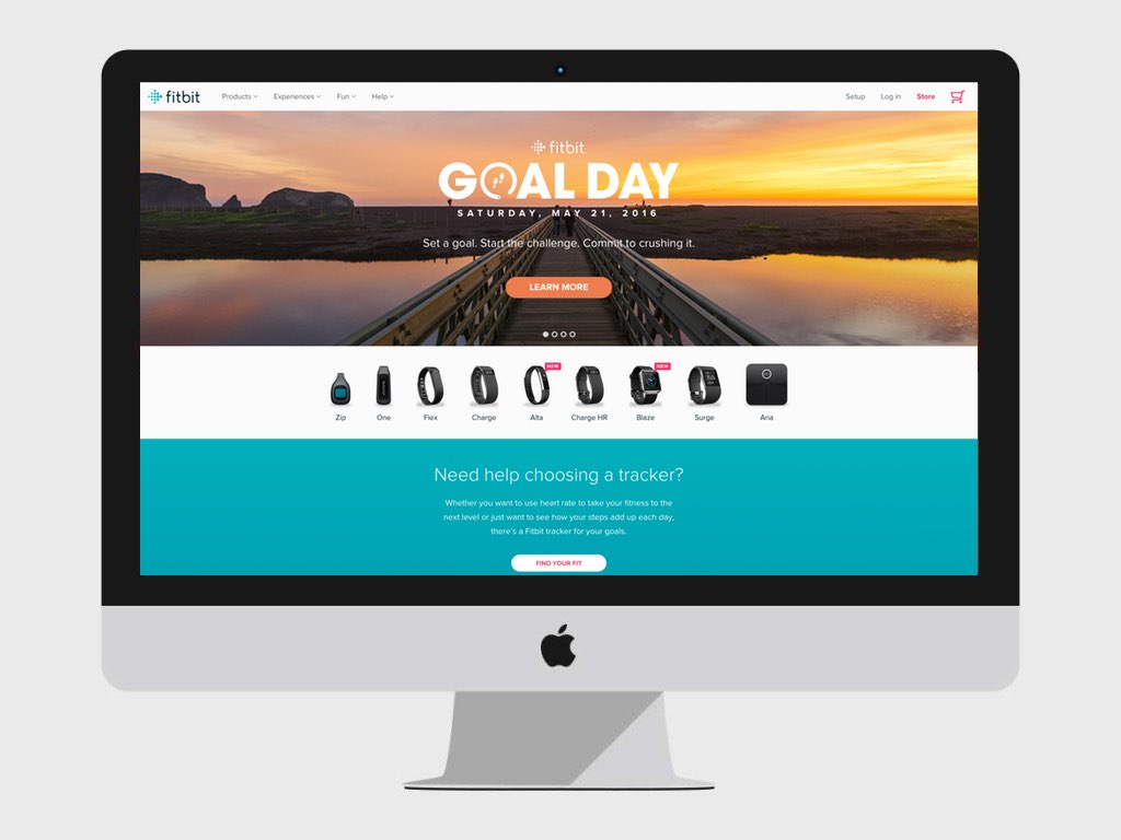
The designers at FitBit use color advantageously to establish hierarchy in sections and emphasize call to actions on their website. Action orange lies over the deep brown color of the bridge as primary CTA and throughout their site. The teal color is used to designate a new section that pulls interest further down the page.
In Creating Exciting and Unusual Visual Hierarchies, the authors further write “Color has numerous roles to play in creating hierarchy, adding a dimension to the order of information. Bright and vibrant colors tend to attract us, while softer paler colors can be used to subdue detail.”
This principle plays out in FitBit’s use of color to establish visual hierarchy.
What Color Means, Matters
This perspective on color is by no means exhaustive. Rather, we hope it serves as a reminder of how color significantly affects your design. It’s easy to gloss over the meaning of different colors or assume that certain colors will always flow with a design. By understanding what different colors mean and how to use them strategically, to guide your users and enhance the brands and digital experiences you create. What colors mean, matters.