Thriftbooks
A site worth bookmarking
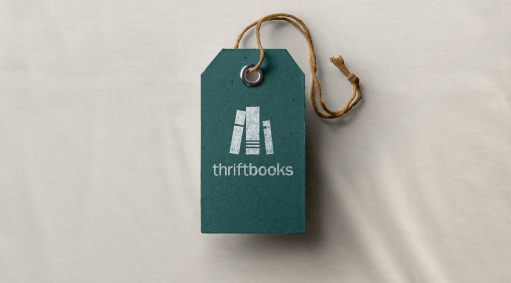
Fresh revitalized Thriftbooks’ online presence to unite their users around a love of reading and provide seamless access to millions of used books.
The Challenge
Thriftbooks is one of the largest sellers of used books in the U.S., selling nearly 12 million volumes a year. But despite their extensive reach and impressive customer value, their website didn’t do justice to the software under the hood, the brand promise, or their pioneering approach to e-commerce automation. While addressing these various components in the UX of the site was the primary focus, we also needed to evoke the timeless experience of reading and exploring a bookstore through the brand, which, in the crowded e-commerce space, is one of Thriftbooks’ key points of differentiation.
Our Solution
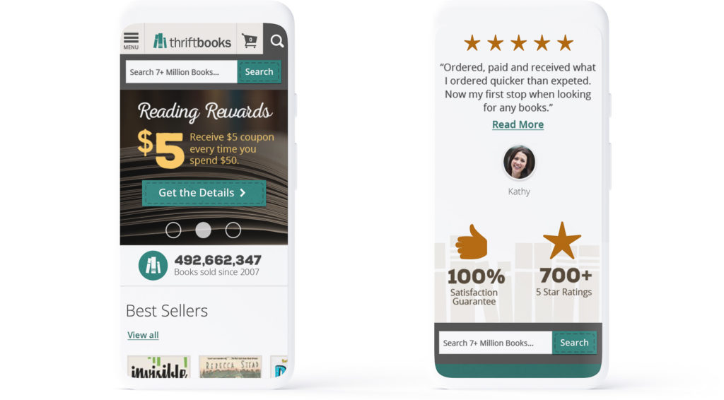
Two core personas historically visited the Thriftbooks site: readers and booklovers. Our task was to design a brand experience that evoked a modern aesthetic—bold, clean, and bright—while also incorporating the tactile warmth of a well-loved book. Additionally, we designed a more seamless shopping experience for Thriftbooks’ massive customer base, ensuring that users spend less time navigating the site and more time reading.
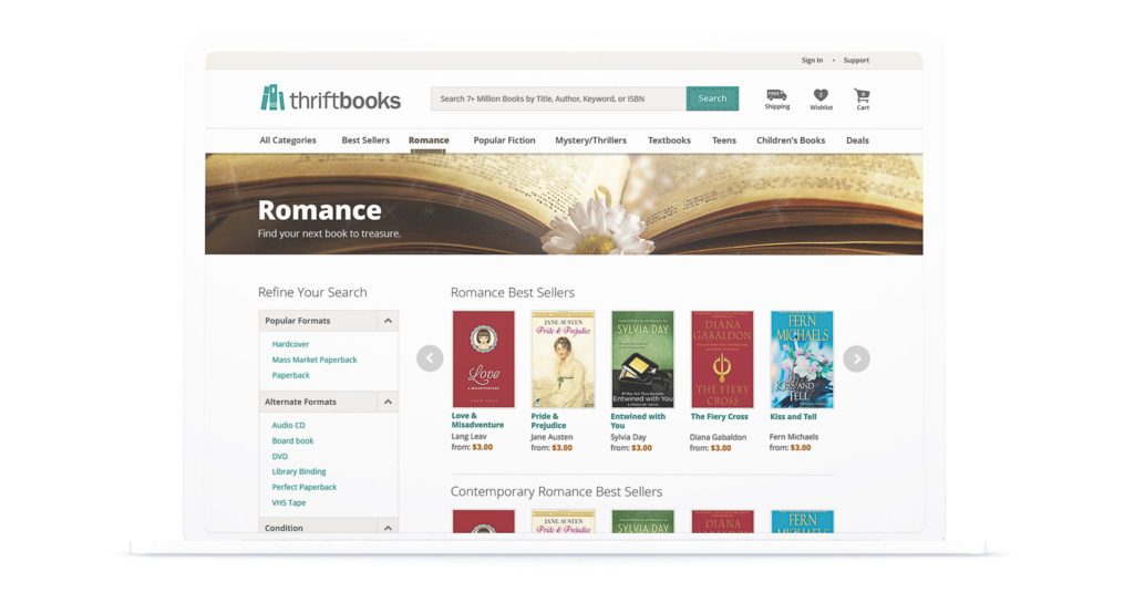
Consistent brand communication
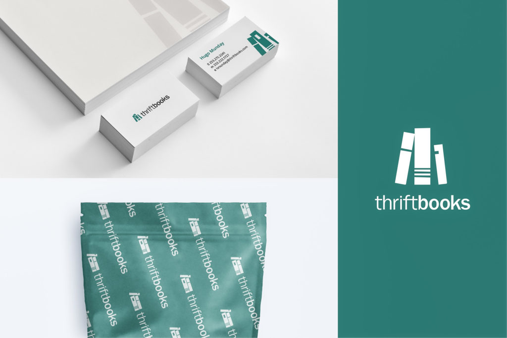
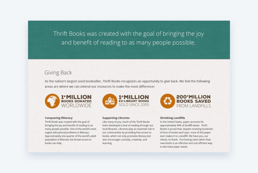
The Thriftbooks website was a key emphasis, and our strategists and designers needed to ensure that every element of the new brand was woven throughout its various pages, filters, and points of user interaction. But the brand also needed to translate to Thriftbooks’ other customer touchpoints: business cards, print collateral, packaging, and much more. We ensured that everywhere users encounter Thriftbooks, their impression of the brand is consistent.
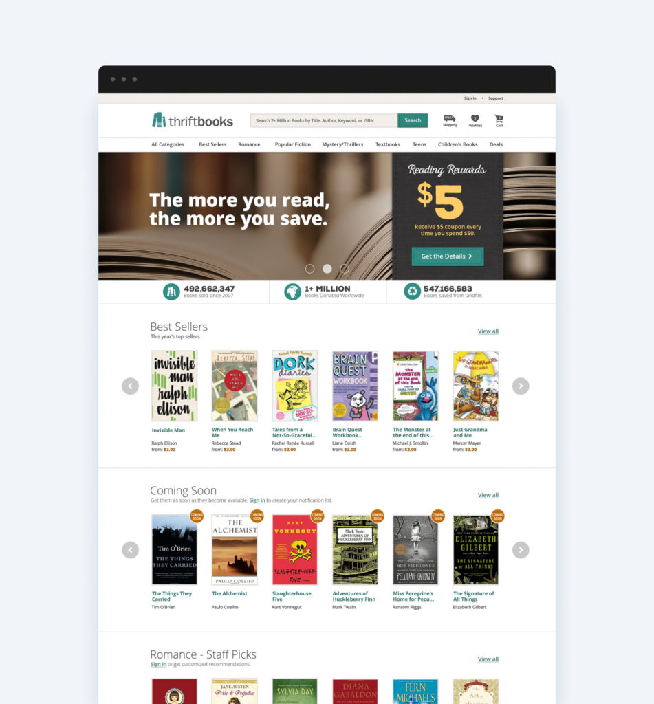
An in-depth UX review
Thriftbooks had the technology to support increased scale, but the site itself was unintuitive. A comprehensive UX review allowed us to identify where Thriftbooks stakeholders could make the most impact. Addressing various UX principles like reducing clutter and increasing scannability, we provided Thriftbooks with a review of all components they need to address and justification for our numerous recommendations.


Modernizing the website
One challenge was properly communicating the notion of “thrift.” While in the client’s case “thrift” implies cleverness, opportunity, and frugality, we had to actively avoid any negative connotation of thrift that would cheapen the brand promise. Strategic messaging and labels throughout the site speak to the money customers save, but the color palette and visual treatment are modern, reinforcing Thriftbooks’ technology-first approach to offering deals and ensuring customers have seamless access to used books.
Telling the story through video
Video is one of the most compelling forms of content, bundling numerous ideas and explanations of customer value in a short, easy-to-grasp format. While the bulk of Thriftbooks’ messaging and brand experience were promoted through copy, navigation, color, and iconography, video supported our storytelling efforts and reinforced the notion that when shopping with Thriftbooks, users save considerable time and money.
6%
mobile conversion increase
93%
users preferred new design over top competitor's
“I absolutely love this video. I especially love the narrator’s voice as a match to the imagery. Bravo! Outstanding work. More More More!


