Article
UI/UX Principle #20: Use Icons Appropriately

April 8, 2016 ...
An icon is “a symbol or graphic representation on a screen of a program, option, or window.”
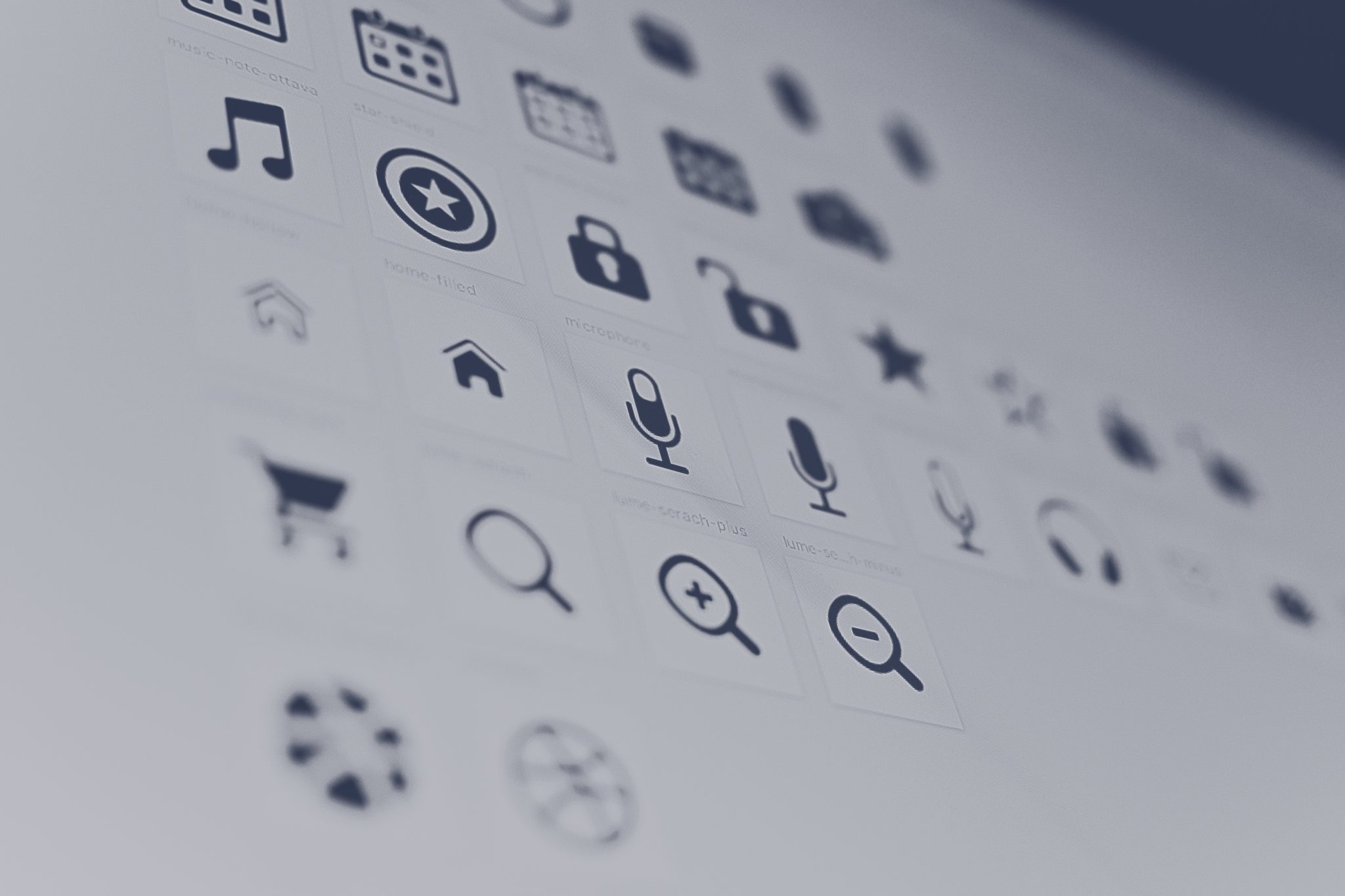
Icons are ubiquitous – you see them on computer desktops, iPhones, Android, and Windows phones, and web pages that span across the Internet. Icons constitute a visual language.
Without relying on words – although they are often accompanied by a label when necessary – icons communicate meaning about what users should click on, how they can efficiently navigate a page, and how they can engage in a digital experience.
The demand for a consistent visual language is readily apparent – on the millions of websites across the Internet, in the millions applications, and on the millions of product interfaces available to consumers, icons are everywhere.
But you can’t just pick any icon, put it on your website or the interface of your application, and expect that users will understand what it means. Although icons are aesthetically pleasing from a graphic design standpoint and efficient in the way that they make use of a limited amount of space to convey a more complex idea, they have to be used sparingly, be authentic, be scalable, enhance usability, and inspire interaction.
Use Icons Sparingly
It’s a very common mistake to walk into a web or mobile app project and have a client want to use an icon for everything. They are visually appealing. They make use of space in an efficient, economic way. They add flavor to a brand. But overloading with icons can detract from the overall experience in a variety of way.
In an article titled Use and Abuse of Icons in the Modern Age, Sven Lenaerts writes “One of the most common mistakes we make is that we use too many icons in a given setting. Icons are most effective when they improve visual interest and grab the user’s attention. They help guide users while they’re navigating a page. Use too many icons and they’ll become nothing more than decoration. Their use for navigation on a webpage can often cause dilution.”
A key point is that generally, icons don’t always lead to great usability. When they are used as “decoration” and cause “dilution,” then you’ve strayed from the very purpose of using icons in the first place: that is, using a carefully selected visual symbol to communicate an idea, concept, or function simply and clearly.
Icons can be confusing. They look pretty cool, but it takes time for people to figure out what they mean (unless they’re common or conventional) and the majority of people using websites and applications don’t want to spend their time thinking about what the icons on the page mean.
Icons Need to Be Authentic
This is a simple point: icons are a part of your visual language and brand, so it goes without saying that they should fit. Sometimes key icons are almost as important to your brand identity as the logo itself.
Google’s logo is the large word (or uppercase G in certain instances) that graces their search engine and other products. But in Drive, Google has Material icons that serve an incredibly important purpose: you can quickly locate and utilize Google Search, Gmail, Google Calendar, and Google Docs. All of the icons fit their brand and provide quick access to important applications.
You may want a simple icon or a more sophisticated icon based on how it fits your brand guidelines. But the important point is that icons compose a visual language that people can recognize universally – for this reason, they need to be authentic.
Icons should be Scalable and Adaptable
Many icons are in an SVG (Scalable Vector Graphics) format. They can easily be re-colored, reshaped, or change appearance, via-mouseover, using code or some simple formatting changes in Adobe Illustrator. For this reason, creating a new graphic isn’t necessary as they can be modified page-to-page using the same basic assets.
There are great libraries to pull in icons as fonts, so they scale really well. Great libraries include The Noun Project, IcoMoon, and Font Awesome. The libraries contain a variety of vector based images that scale well with responsive experiences and are easily adaptable based on the look and feel you are trying to create.
Icons Can Inspire Interaction
Icons can inspire a lot of engagement. If you want people to check out after shopping, a shopping cart is the visual clue that will inspire them to do so based on the fact that it’s so conventional and universally understood.
Icons can also be used to show the unique characteristics of a product. Making icons interactive, often with animated GIFs, is a common trend in modern user experiences. There is good motivation behind this. Icons, animation, and movement encourage interest and further exploration. When static objects come to life, curiosity is piqued.
An icon can carry meaning with a little motion. For example, a heart icon that starts beating will bring more meaning and interest than a static heart.
How to increase Icon Usability
Convention – Common icons should be recognizable. The printer icon always means “print.” The bold B means “bold.” On eCommerce websites, the shopping cart usually leads to the screen from which you can add items, delete items, or checkout. Icons need to be consistent if intended to be understood universally. It’s not always necessary to get innovative. Stick to what’s conventional unless the situation calls for innovation.
Consistency – Icons that serve the same function, across different websites, should have a consistent look and feel, even if they look subtly different. Icons are intended to provide simple visual clues and consolidate screen space, rather than having a long sentence to explain each function and feature of a website or application.
Labels – If it takes longer to think through what an icon means than read through text that describes the same functionality, then you’ve failed in your purpose of using an icon. Include text if necessary, but make that count as well. If there’s a good reason for using an icon, there shouldn’t be as much text.
Often, however, pairing an icon with a label will increase usability. In a piece written about the usability of Microsoft Outlook 98’s toolbar, Jensen Harris wrote “Different fixes were tried: new icons, rearrangement of the icons, positioning icons under the menus from which the commands came from. In the end, one change caused a total turnaround: labeling the important toolbar buttons [ . . . ] It’s not really any big surprise if you think about it. It’s pretty rare in the real world that we rely on iconography alone to represent ideas. Bathroom doors generally have an icon of a man and the word “Men.” Stop signs have the word “Stop” on them.”
Windows, iPhone, and Android interfaces often still have labels next to the icons as part of their standard usability guidelines, and there’s a reason why. As we stated earlier, if it takes longer to think through an icon than read through text, you’ve failed in your purpose of using an icon. It’s important to strike the balance between text and labels.
Ultimately, it comes down to the little details that combine to set experiences apart and bring high-end experiences together. By taking icons seriously, you are taking your experience seriously as well.