Article
3 Tips to Optimize Functionality UX Design

September 19, 2013 ...

Functionality
“It matters little that something is easy if it’s not what you want.” Nielsen Norman Group
Behind technical brawn and design sheen, websites must deliver functionality that users want. There must be utility.
It’s important to remember the ultimate reason we build a website. It should do something that we can’t do anywhere else. Maybe it connects us. Or provides access to a tangible product. Or maybe it inspires and educates us. Regardless of the form, functionality is the core.
Even a Billion Isn’t Cool Anymore (Facebook)
“Engineers and designers have long suffered from a tendency to substitute concrete specifications and processes for fuzzy user behaviors — but users don’t do that.” (Smashing Magazine)
A site’s mission should not be confused with the delivery mechanism of how it does it. Mark Zuckerberg has been outspoken about his company’s adherence to a mission, rather than committing to the tactics of achieving the mission: “Give people the power to share and make the world more open and connected.”
For a company as large as Facebook has become, it would be easy to get caught up in the weeds of tactics: creating a universal login tool, or a growth platform, or even attracting the most members. Many elements of the Facebook UI have been justly criticized, but there is no question that the company is giving people what they want. The site purportedly captures 20% of all online time. Behold the power of functionality.
3 Tips to Optimize Functionality UX Design
Fresh Consulting’s 8 Methods of UX Analysis evaluate various criteria for website usability. The remainder of this post addresses 3 tips to optimize functionality UX design:
1. Prioritize Accessibility
“Have things happen when users expect them — either because of their existing expectations or because you’ve clearly communicated what to expect.” – Nielsen Norman Group
The best functionality is rendered useless if people don’t know it’s there, or if it is so cumbersome that people aren’t willing to seek it out. Many interfaces offer users a number of choices of how to access features. Prioritization is key.
Every site is different. Streaming video is much more important for Netflix than is is for the Apple store’s site. The most critical tasks should be easily accessible and prominent. Secondary functionality should not upstage the primary purpose. One way to make priority functions accessible is to implement Fitts’s Law.
Fitts’s Law
“The time required to rapidly move to a target area is a function of the distance to the target and the size of the target.” Paul Fitts
According to Fitts, there are two ways to make a function accessible:
- Make it Big
- Make it Close
The most important functionality should use a combination of size and placement to help users access it quickly and easily.
Netflix
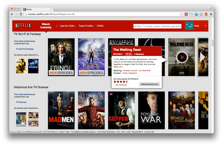
For Netflix, the most important function is streaming video. The site uses a gallery of teaser posters which serve as play buttons to directly access the streaming content. Ancillary functions include film information, search, saving lists, and reading and creating reviews.
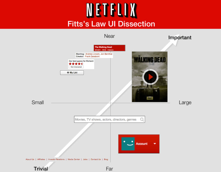
UI Element Dissection (Most Accessible to Least Accessible)
- Play Button: This is the largest element on the screen. It’s a good way to make accessible the most important functionality.
- Title Details and Actors: This content is important in making a quick decision. It’s not large, but with the modal pop-up it’s in close proximity to the mouse.
- User Review: Slightly farther away and small. Appropriate for ancillary function.
- Add to list: Slightly farther away and small. Appropriate for ancillary function.
- Search Bar: Medium size and mid proximity. In this case it’s more about the conventional location of a search bar than adherence to Fitts’s Law.
- Account Settings: Again, the size and placement are adhering to standard conventions.
- About, Contact, Etc: Small placement at the bottom for trivial functionality, as dictated by conventions.
We dissected the Netflix UI and reviewed how each functional element is prioritized on the main user page. It’s impossible to prominently display dozens of viewing options at the same time because there is only so much browser real estate. So Netflix took the size route here. The teaser posters that serve as play buttons are huge.
For the secondary functionality, positioning is key. When you hover over a selection, a modal pops up with descriptions, actors, and lists just a few pixels away from the mouse’s current position.
Tips to Prioritize Accessibility:
- Most important tasks live in high value areas
- Minimize number of clicks from homepage to functionality
- Scrolls and clicks are purposeful
2. Manage the Learning Curve
“Even the best designs can’t create perfect usability where everybody understands everything without any effort whatsoever. The goal is to set the stage for users to understand the workflow, without slowing them down.” Nielsen Norman Group
Again, every site is different. And many sites create innovative features that have never been seen before. The learning curve for any feature should never scare away the target users. Start simple and familiar. Then gradually introduce more complex and foreign features for the power users.
SeatGeek
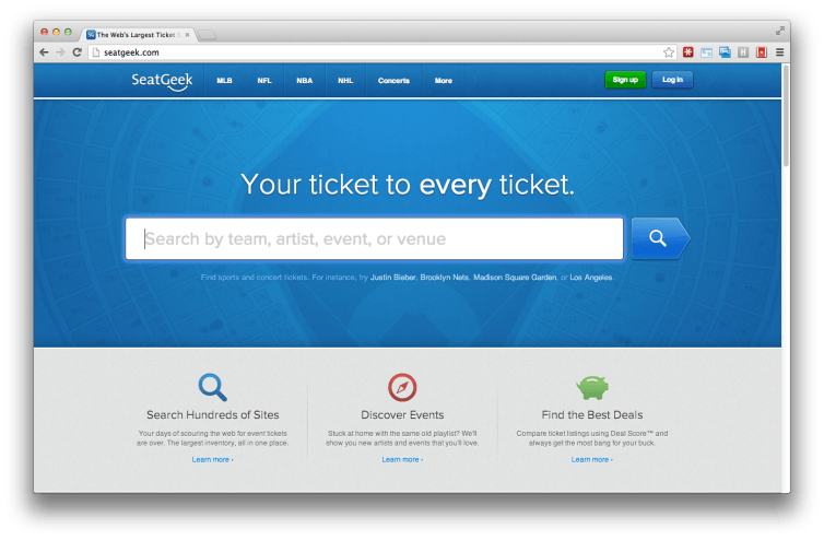
SeatGeek takes it nice and slow from the start. The exaggeratedly large search box tells users this site’s primary function is finding things: tickets. Since most internet users are well acquainted with search boxes, this is a quick way to ease into the site.
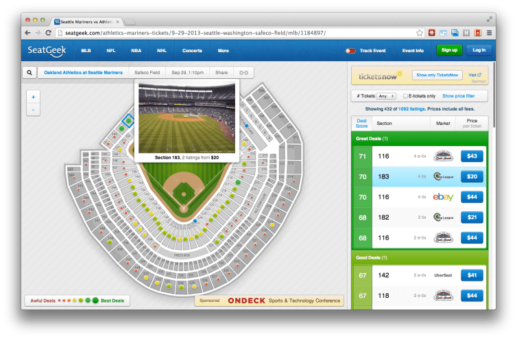
SeatGeek’s event detail page presents expanded options without overwhelming the user. You either find your seat on the map or on the price list. In the simplest scenario, all you have to do is click on a seat, or click on a price, and you’re done. Both options immediately lead to checkout. So a first-time user looking for a quick way to pick up Pearl Jam tickets can be done in about 3 clicks using universally recognized functions.
Power Users
“Advanced features don’t have to be front and center to appeal to power users — as long as they know they exist, they’ll seek them out.” Nick Petri
If the user has time to stay and explore, some of the more complex functionality becomes evident. A variety of filters helps select the best seat in the house. The site’s proprietary “Deal Score” uses an algorithm based on historical data, location, and angle to the field to assess if the quoted price is ‘a good deal.’ The more complex functionality is layered on top of the basic features, so the page is easy to use from the start.
Tips to Manage the Learning Curve:
- Buttons should be easily associated with the related function
- Emphasize the call to action
- Use progress bars for multi-step processes
- Sort and filter is available where needed
- Where necessary, comparisons are easily made (e.g. between products)
- Unwanted features can be stopped or skipped (e.g. music) and off by default
3. Function over Form
“A product has to work equally for all its potential users if it’s to accomplish its goal.” (Smashing Magazine)
It’s tempting to focus on the form of the interface and forget the function. A classic example is the checkout process on any e-commerce site. Historically, online purchases forged an unholy alliance with user registration. Checkout forms and registration forms both asked for a name and email address, so it made sense to do them both at the same time if you are only thinking about the form of the action.
In reality, the sales function is driving the user experience, and requiring log in or registration can bog down the process. Surprisingly, a large number of sites still require registration before allowing users to pay them money. This mentality applies to any task or feature.
Sears
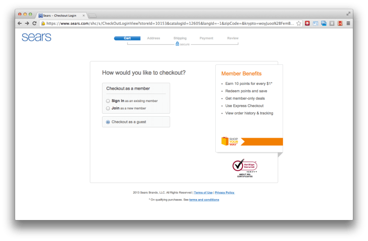
Sears uses the following elements to keep function over form:
- People ready to spend money have the option to continue as a guest.
- The pitch for registration is visually contained as optional information.
- An enclosed checkout hides everything but the logo – no distractions, no links
- Security features are highlighted – a nice reminder before sharing your credit card
- The task is segmented into chunks, with a progress bar indicator
User Experience Extends Off Screen
Overall, Sears offers a user-centric checkout experience. I recently tried their site as a first-time buyer. The checkout process went smoothly, and I elected the same day in-store pickup option. When I arrived at the store, I entered my name in the Site to Store kiosk. In less than two minutes, an associate had loaded my purchase into my car, and I was gone.
Next time I need to make a similar purchase I am likely to return to Sears.com. My experience as a user of the site extended beyond the browsing time. The user experience isn’t just software, or even hardware, it’s the whole package.
Tips to Keep Function Over Form in e-Commerce Sites:
- Critical/Irreversible tasks have confirmation before submitting
- Key tasks are free of errors (technical)
- User registration process is not overly complex
- Membership sites provide public preview before registration
- Automate where possible
- Don’t require the same input multiple times
- Transactional data is saved and retained for users to leave and return (where appropriate)
Additional Reading on Functionality
UX Functionality
Nielsen Norman Group – Application UX
Smashing Magazine – Essential Guidelines for Functional Design
Mashable – Website Usability Tools
Smashing Magazine – Elements of Mobile User Experience
Technori – UX Design Product Features to Include (Kano Analysis)
Fitts’s Law
Smashing Magazine – Fitts’s Law
Ask Tog – Fitts’s Law Quiz
UX Learning Curve
Mind the Product – Fear or the Fallacy of Intuitive UX
Open View Partners – Can Usability Be Sticky?
UX Booth – When Learnability is More Important Than Usability
eCommerce
Baymard – Analysis of Checkout Functionality for Top 100 eCommerce Sites