Article
UI/UX Principle #54: Great Experiences Still Need Great Onboarding

October 20, 2017 ...

By focusing on great onboarding experiences that encourage discovery and learning, you can increase your engagement, your conversion, and your retention rates – three common high-level metrics for any application.
We recommend investing in onboarding no matter how intuitive your application is, based on the significant value it adds to the overall experience.
Smashing Magazine found that: “90% of all downloaded apps are used only once and then eventually deleted by users. People often abandon apps because of a poorly designed interface or an overall negative experience. Instead of having their problem solved by the app, people get confused trying to wade through a jungle of screens, menus and buttons.” Hence the deep need to invest in onboarding! Even though creating great onboarding requires time and a concerted design effort, it correlates strongly with your objectives of conversation and retention, so the consequences of not having it are much worse.
There are dozens of techniques; however, here are three universal methods you can start focusing on right now:
#1: Interactive Onboarding Wizards that get your users further engaged and converted
#2: In-Line Learning that trains your users as they go
#3: Empty States that motivate, persuade, and direct
Method 1: Interactive Onboarding Wizards that Get Your Users Further Engaged and Converted
Method 2: In-Line Learning that Trains Your Users as They Go

The GIF illustrates how the application teaches users three key functions of Slack:
-
Starring a message
-
Responding with an emoji
-
Pinning a message
Method 3: Empty States that Motivate, Persuade, and Direct
When a user loads an application for the first time – when there’s no data yet to be displayed – you have an empty state.
Empty states are often an afterthought in design, but they have the opportunity to be part of a user’s first impression.
Rather than leaving users with an empty screen that increases confusion and impacts usability, consider focusing on creating helpful empty states.
Below are two wireframed empty states: the first with dummy data (“0 Visits”) that shows users what their dashboard will look like once it’s populated with information.
The second wireframe has a populated empty state that’s more engaging and helpful, and shows users what they can expect once they start using the app. It’s much easier to visualize the results you’ll get, and start seeing the value of the app.

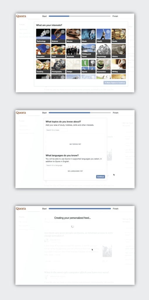
Quora: An Example of Comprehensive Onboarding
Quora – a question and answer website with responses crowd-sourced from its users – is a simple app at its core.
But designers and developers at Quora have invested heavily in the onboarding experience. Quora’s onboarding has several key features:
- Progress bars to guide users through steps to setup their account
- “Getting started emails” to create additional understanding
- Tutorial boxes interspersed throughout onboarding
- A task list for a user to set up their account
- …and much more
Conclusion: Every App Needs an Onboarding Experience
In this post, we’ve mentioned a variety of applications – from language learning to group messaging, to a repository for crowd-sourced information.
While your application might be different, the same principles apply.
In addition to the three mentioned in this article, there are dozens of onboarding techniques. Bottom line, great experiences still require great onboarding. The value lies in increasing your engagement, conversion, and retention.