Article
UI/UX Principle #51: Use Progressive Disclosure to Simplify Complexity

May 24, 2017 ...

Da Vinci said “Simplicity is the ultimate sophistication,” and today, successful digital applications are no exception.
In digital UX design, presenting features, navigation, and information in layers progressively allows designers to keep it simple.
Great user experiences encourage discovery while hiding the complexity that can otherwise overwhelm a user. After all, not every use case requires offering users access to everything at once.
However, there’s often a tendency to present all information and functionality to users at the same time. It’s easy to do when you design experiences in a static form.
The idea of progressive disclosure is providing only what is required for a given task. That’s why designing interactions – which have layers built into them – matters so much.
3 Basic Examples of Progressive Disclosure
Mega Menus, Overlays/Popovers, and Hover Controls are a few of the many design elements that UX professionals use to create progressive disclosure. The shared purpose of these elements is that they allow designers to release more navigation, functionality, and information/data when users need it.
Mega Menus: Reveal More Navigation and Information When Needed
One of the more complex structures on websites is the navigation structure. So, how do you go about simplifying it for the majority of users while exposing deeper layers as needed?
Mega menus – large menus that allow designers to hide navigation, related information, and functionality until users need it – are the design element to do just that.
How do mega menus enable progressive disclosure?
Mega menus surface navigation options according to importance or hierarchy. This is an alternative to providing a large list of links that users have to scroll through, regardless of their use case.
Not all users need access to the deepest layer of your website or application, and this tool for progressive disclosure allows users to access deeper levels as needed.
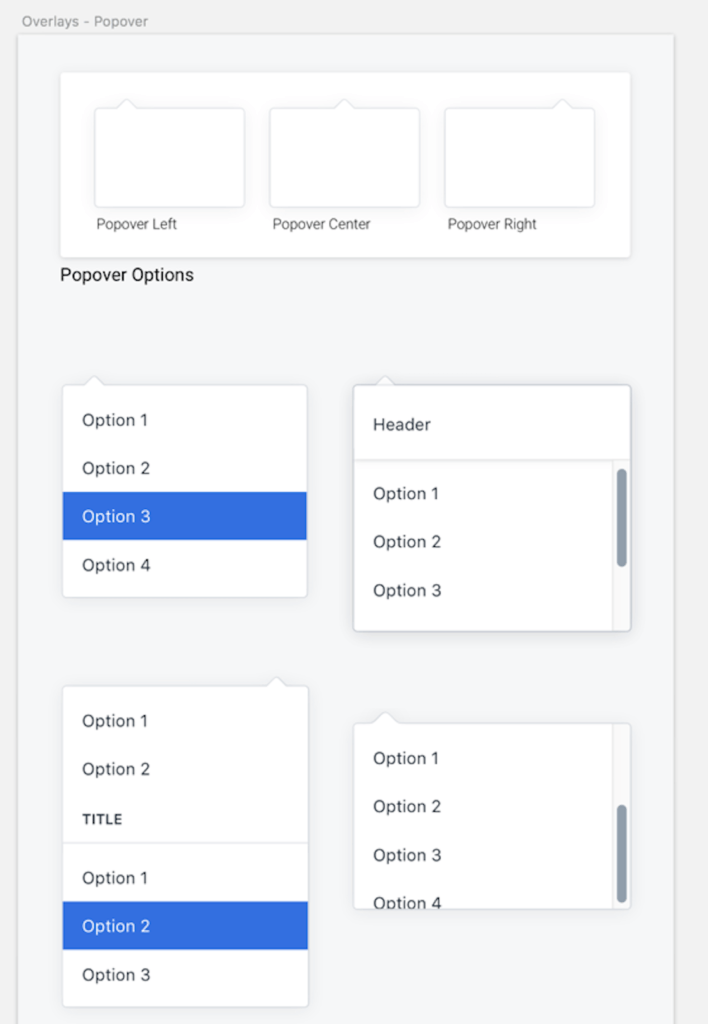
Overlays/Popovers: Presenting More Information and Features When Needed
Bootstrap defines popovers as “overlay content [added] to any element for housing secondary information.” Popovers are used to reveal more information to users as needed, hiding it from view otherwise.
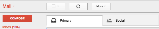
Consider the basic functionality of Gmail in how it users progressive disclosure in the few examples below…
- When you look at your inbox, it presents you with some basic buttons and has one more button to hide additional functionality that isn’t needed as often.
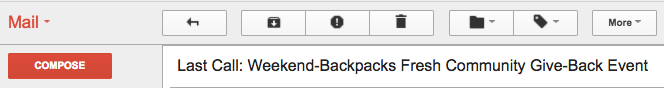
2. When you open an email, it presents more buttons and functionality that are used fairly often, and it still has one more button to hide functionality that isn’t needed as often.
3. Then there’s the grid icon on the right. It opens up an overlay/popover (that is otherwise hidden from view) with more features included in the Gmail suite. By scrolling down, additional features are progressively disclosed:
Do you only need Gmail to send and receive emails? No problem. Click “Compose” and you’re all set.
But if you’re a power user who is using Gmail as more than a simple email inbox, click the grid icon. Via progressive disclosure, you can scroll through the popover to find a calendar, other applications within Google Drive, or other less used features that fit your specific use case.
Hover Controls/States: Present more Functionality and Information when Needed
Throwing every feature to the user right out of the gate could be overwhelming. Worse yet, it might cause them to bounce from your application or website and use something more simple.
Interactive Animation and Motion are tools that go along with hover states and provide endless possibilities for progressive disclosure as well. Whereas motion was simply added for flair a decade ago, today, it is a powerful tool for usability. With hover controls and motion, they can aid the process of revealing new features by easing navigation in on hover, providing microinteractions that present more information, or helping show the transition to the next state. See a basic example below of showing additional features and navigation on hover.
Understanding the form and function of motion will give you a competitive advantage when designing hover controls.
Consider using motion as a tool to create progressive disclosure. Unveil more functionality when users need it, and point their attention toward additional functionality with the uses of motion outlined above.
Simple Experiences can be Complex to Make
It has been said that simplicity can be at the edge of complexity and we’ve found that truly simple and easy-to-use applications are often more sophisticated to make. For example, designing in layers and including heavy interaction design in your design & prototype process takes more thinking and more time. Drawing on principles like Progressive Disclosure mentioned in this post, Motion as a form of Usability, and Addition by Subtraction will help you be more strategic as you plan, design, and implement an amazingly simple experience.