Article
UI/UX Principle #53: More Flexibility Can Lead to More Complexity

August 23, 2017 ...

Imagine a computer science class – the teacher starts by introducing you to five complex subjects ALL at once!
The first day of class? Data structures. Algorithms. Cyber security. Server optimization. Database management.
There’s a reason computer science courses aren’t designed that way. Knowledge, skills, and familiarity with a subject should be layered. The key lies in starting with the basics and building knowledge from there. Otherwise, the student easily becomes cognitively overwhelmed.
The same principle holds true when designing a website or product that focuses on user experience. Too many options to choose where to place your interest and attention – in other words, too much flexibility – and complexity will quickly reach the breaking point.
Complex websites and applications can burden the user by making them overthink. Steve Krug dives into this problematic aspect of UX in his seminal text, Don’t Make Me Think, Revisited. Bottom line, as UX designers, we should be cognizant of “interaction cost.” Nielsen-Norman Group defines interaction cost as “the sum of efforts that the users must deploy in order to reach their goals.”
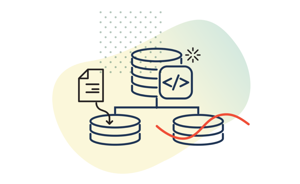
We layer the information and functionality of user experiences for this very reason. There’s a tendency to “stuff” product experiences with too much flexibility and functionality at the outset, where more leads to less comprehension. We argue that there’s value in starting with less, as simplicity and clarity lead to decreased complexity. By avoiding too many options and flexibility that lead to more functionality on the same screen, you can have a better chance of retaining and capturing users’ continued interest and discovery.
Read more below about 3 methods we recommend to focus on striking a healthy balance between flexibility and complexity in UX.
Method 1: Conduct User Testing
Regarding “interaction cost,” The Nielsen-Norman Group states that:
“Interaction cost is a direct measure of usability [ . . . ] A quick assessment of the interaction cost of a design can save a lot of money in the long run, as it can give you a good measure of how difficult the interface is going to be for the user. It can also serve as a comparison tool between design alternatives: usually, the one that minimizes the interaction cost has better chances of success.”
Research shows that humans, due to “an increasingly digitalized lifestyle,” now have attention spans of 8 seconds – shorter than goldfish. Designing websites and applications that cater to short attention spans is crucial. The less time a user spends deciding between options, the lower the interaction cost.
This can be assessed through UX testing, with observational time-based tests and A/B testing of different design flows. The time it takes the user to complete a task is a quantitative indicator of efficiency. The number of questions or options a user has to wade through can be a qualitative indicator of comprehension.
Method 2: Utilize Hick’s Law
A website or application with more flexibility and more options will typically take more time to comprehend.
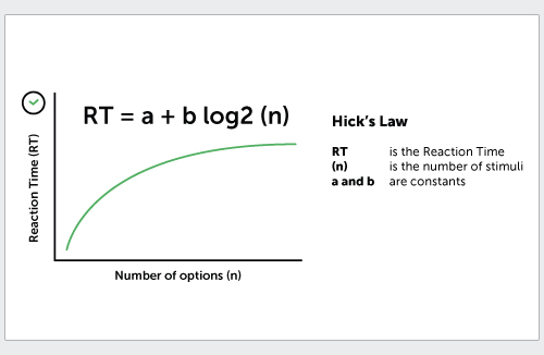
We recommend understanding Hick’s Law. It’s another useful way of assessing the cost of interactions. Hick’s Law measures the time it takes for users to make a decision: the time it takes to make a choice is inversely proportional to the number choices provided.
When evaluating usability burden, consider the number of options on the screen and how much time that will add for a user to be able to make a decision.
Bottom line, too many options, features, and customization is not necessarily a good thing. The more options a user has, the more reaction time required. More options lead to more time needed to make decisions – a high cost of interaction.
The “More is Less” adage applies here. Having fewer options doesn’t mean less sophistication or functionality. It simply means that less is shown on the screen until it is needed for a user to accomplish a given task. This, in the end, will decrease the amount of comprehension time spent, decreasing the interaction cost.
Method 3: Use Progressive Disclosure to Enable Faster, More Thorough Comprehension
As technology becomes more sophisticated, there’s an impulse to add more options and flexibility on the same screen. But, too much may actually hinder the productivity of the user.
Providing choices and customization, appropriate to the task at hand, increases usability. A simplified UI allows users to spend less time making decisions. This maximizes productivity and decreases interaction cost.
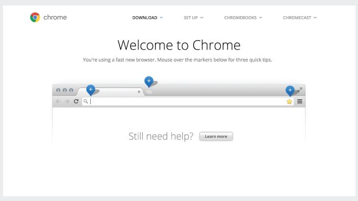
Google Chrome has purposely hidden most of their settings, extensions, and help functionality to make the experience simple on the front-end.
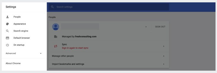
Google could complicate the experience by putting more functionality and settings in the browser frame or in onboarding. But they’ve purposefully kept it simple.
The more progressive disclosure you include, the smarter the workflow.
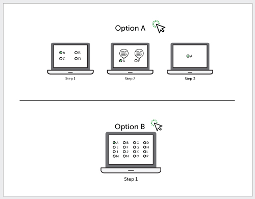
For T-Mobile, we took a 7-step process down to 3 steps. We made the form simpler, showing less information by using progressive, “smart” disclosure.
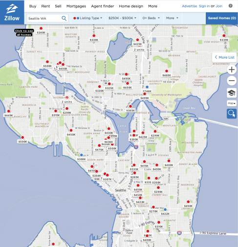
If Zillow knows your budget threshold and zip code target, it can hone in on relevant options. The system can present more information tailored to you.
Less Is More Focus & Comprehension
Experiences with a decreased interaction cost will be easier and more pleasant to use.
You can get there with simple methods like user testing, designing with Hick’s Law in mind, and focusing on progressive disclosure.
Great teachers make it easy for students to progress through complex subjects by providing focus and easing comprehension. Teaching is an art. So is design. To create great designs, keep these simple, universal principles in mind. In the end, the “More is Less” adage applies here for focus and comprehension.