Article
Top UI/UX Trends in 2015

Entering a fresh year always feels like a good time to take stock of and reflect on the evolution of trends in our field. As a creative, digital consulting firm often doing UI/UX work, Fresh Consulting focuses on delivering the most up-to-date design features to our clients with the goal of elevating user experiences. Below is a list of the top UI/UX device, design, and engagement trends we are thinking about and reading about that we foresee shaping our work in 2015.
Device Agnostic Information Flow
Laptop. Netbook. Tablet. Phablet. Phone. TV. Appliances. Gadgets. Wearables. Without a doubt, the one trend we see informing almost all other trends is device agnosticism. Some of the best applications send information to many devices, syncing with the cloud, allowing users to take their information with them whatever they are using.
Nielsen’s 2014 U.S. Digital Consumer Report revealed that the average American now owns four digital devices and spends 60 hours each week consuming content on them. Forrester Research found that 90% of users who own multiple devices start a task on one device and finish it on another – and, over 50% of those users reported using more than one device at the same time for complementary activities like texting or tweeting while watching a show. Whether usage is sequential or simultaneous, designing applications and user experiences that function seamlessly across devices is essential to ensuring that users remain engaged as they shift from one to another…to another, and back again.
Responsive, the New Norm for Websites
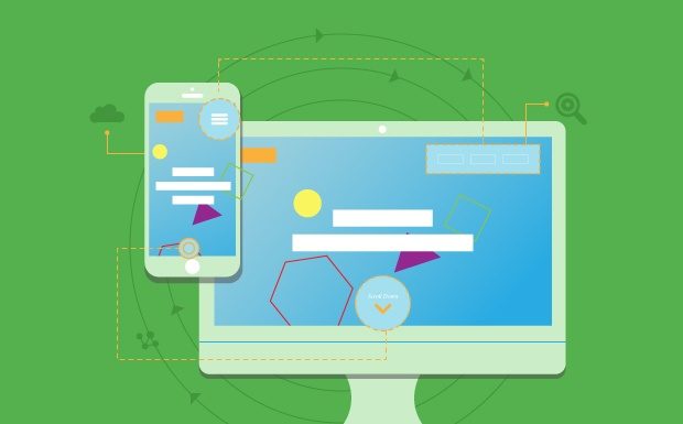
As devices increase in both quantity and variety, design focus must shift away from the device and towards content—not just what that content is, but how it’s organized and delivered. Responsive design certainly isn’t a new concept, but given the surge in mobile and multiple device usage, we will see it emerge as the norm in 2015 for websites.
ComScore reports that smartphones and tablets combined now account for 60% of total time spent on digital media. Users expect to access content in familiar and easily digestible formats regardless of the device they’re using. Responsive design addresses this with functionality and flexibility, incorporating modular elements that scale by percentage rather than specified screen size to deliver uniform experiences.
At Fresh, our focus is on making great responsive experiences, not just responsive experiences. There is a difference.
Responsive for Larger Resolution takes on a new focus
W3 reports that 99% of our visitors have a screen resolution of 1024×768 pixels or higher, and 78% have greater than 1366 x 768. With larger screen resolutions on the rise on tablets and laptops + larger screens on the rise (such as projecting to TVs), there will be a new focus on designing for larger resolutions and larger screens for those that have already tackled the mobile size. For example, sites like Amazon expand core content width to 1500 pixel and MSN.com to 1275+ pixel width and we’re often building new websites at 1200+ (example here), whereas most website are still designed for 1028 width. The quality of the content should remain consistent regardless of the scale of the device.
More clarity on when to use Mobile responsive vs. Mobile adaptive vs. Mobile site vs. Mobile app
With the surge into catering for the overwhelming use of mobile users and devices, there will be more scrutiny and focus on when to use a mobile site (often with m.domain) vs. mobile responsive site vs. mobile adaptive site vs. mobile app, or some combination of the aforementioned. For example, eBay and Amazon have an adaptive mobile site and mobile app, whereas Walmart did just a mobile responsive site. Why the differences? Great mobile behavior and speed can push some larger applications to avoid responsive mobile sites and focus on mobile or adaptive mobile sites instead. Others have mobile web sites but immediately push users to download their mobile app. Cost and complexity are components of consideration of all options also.
While the benefits of a mobile responsive site will fit for most marketing websites, many big websites will have to weigh whether a responsive website (client side responsive) will provide a strong enough user experience. Mobile sites on a different m. sub domain and adaptive mobile sites typically focus better on mobile behavior because that is the focus whereas the mobile experience can get overlooked with responsive mobile sites. This may seem overwhelming, and it is, but its important and more clarity should surface this year by us and others.
Continued Evolution of the Scroll
I think we can safely say that a general consensus has been reached in the master debate of scrolling vs. clicking: people scroll. And usability studies long ago showed that scrolling to consume content can be faster than clicking. Web design is just catching up, so this isn’t a fad, but a usability decision. While we still need web pages for informational organization there are certainly pros to clicking for many interactions, such as simplifying forms and sequential informational flow for improved e-commerce experiencess, the scroll continues to gain overall popularity for expediency, ease, and flow with consuming content. Bottom line, its faster to consume content than to click through pages.
In 2015, look for more enhanced and dynamic scrolling effects as people combine pages into longer ones. While scrolling has become accepted practice, users still appreciate information hierarchy and intuitive organized design with clear-cut clues that help guide them through a site. It’s important not to be too heavy-handed with scrolling effects. They can require too much page load time and may not function smoothly across all browsers if over-designed. However, when done right, scrolling can augment the flow of storytelling and create a more engaging user experience for consuming content.
Building Interactive Stories
Speaking of storytelling…in 2015, stories will no longer be told, they will be built—artfully constructed around each user, or so it will seem. Expect story-based pages to be much more interactive, incorporating rich images, embedded video, enhanced infographics (aka webgraphics), and personalized content based on user data.
Stories are powerful conversion tools, even more effective than optimization and calls to action, because the user ‘becomes’ the main character. In fact, multiple studies[1,2] have shown that simply thinking about an action sparks the same neural activity that occurs when performing that action. Interactive elements heighten this sensation by personalizing the experience even further with each choice that’s made to advance the story. While the message is certainly important, minimalism is key. This is another UX tool that can easily be overdone. So, don’t lose sight of your goals.
Meaningful Microinteractions
If you love a product – your phone, a new wearable, that great app – chances are, it’s because of the microinteractions. Microinteractions are “contained product moments that revolve around a single use case—they have one main task.” Swipe to delete that email? Microinteraction. Like that Facebook post? Microinteraction. A website or app can have many great features, but if they aren’t easy to understand, use, and adopt, poor microinteractions are likely to blame. Great experiences can be a combination of very tiny very simple very easy microinteractions.
Paying attention to these small interactions with a balance of innovation without violating usability patterns can be key to the success of a new app in a crowded marketplace.
Personalized UX
Once shunned for their involvement in shameless and aggressive promotion, cookies are redefining themselves through far more nuanced use. When used subtly, cookies generate positive user experiences and develop stronger, more personalized client relationships—less tracking, more getting to know you. Yes, the goal is conversion. Not through standard or generic force-fed content, however. Today’s “yummy” cookies generate suggested content, convenient links, and unique layouts tailored to your specific usage patterns. Providing content that is genuinely of interest to a user is the best way to drive your click rate.
Targeted Social Connections
Now that social has gone mainstream, after many years, many B2B businesses are finding that social media marketing is not the magic they hoped it to be. Rather, it’s one of many marketing channels in their reach, but rarely the one that drives the lion’s share of new business (It can be a different story for B2C companies). With the cost of people time required to have good engagement and make a social channel reflect properly on the business, we’re finding clients removing Social Integrations and being more selective about where they promote their integrations.
WebFont Type Diversity
As the availability of free web fonts and reasonably priced font kits grows, and evidence mounts regarding the effectiveness of diverse typeface conversion, text is becoming a more considered and integral element of visual site design. We expect to see custom font usage soar in 2015.
Over the past few years, we’ve seen designers transitioning away from traditional type. A Smashing Magazine study of 50 well-respected international newspapers, magazines and blog websites found that sans-serif fonts, the former norm, were used by only 37% for body copy. Type is also becoming responsive, alongside images and other design elements. While line length and line height typically drive readability metrics for responsive design, font size and style should be at the root of both, especially when customized.
High Impact Imagery and less Stock Photography
Though design has become more streamlined and simplified in recent years, one element used to great effect these days is large, beautiful images—not just photos, videos too. When building interactive stories, these images are the Once Upon a Time… Designers are filling the area above the fold with rich visuals that tempt the user into the story of a site, inviting them to scroll for more.
Hidden or ghost features layer complex functionality on top of this minimalistic approach. Image optimization help keep site speed in check. The results can be quite powerful.
As we focus on high impact imagery, designers and customers will seek to remove stock-looking photography. Stock images have gone mainstream at the spur of the family of Getty stock image websites, such as iStockphoto. Stock that looks like stock detracts from the experience and can be a turn off.
Material Design (A New Kind of Flat Design)
Back in 2013, Gizmodo published a great article explaining the emerging transition from skeuomorphic to flat design. Of course, they also predicted that, “After radical flatness, we’ll probably see designers carefully reintroduce dimensionality where it’s really needed.” That time is now.
This past year, Google launched Material Design, a “mostly flat” design language that “uses very subtle gradients, layering, and animation to retain a sense of the tangible world (physical space and objects) while still achieving all the advantages of flat design”—namely, streamlined, content-focused, and adaptable. It’s not surprising that designers want this type of creative flexibility. In the coming year, you can expect to see more of them following Google’s lead and re-balancing flat design with subtleties that give more context to the desired interaction.
Card Design/Tiled Navigation
Card design emerged prominently on social and news networks as a great way to organize large quantities of content. From Pinterest to Trello to popular news sites, information in cards, often with images, is now mainstream. Modular card or tile formats are highly organized, easy-to-scan, and make information digestible. There is also a lot of flexibility in this approach. Small chunks of information respond well to responsive design, easily reordering to fewer or more columns, or smaller or larger tiles, to suit screen size. They also easily adapt to user preference filtering.
Look for this mainstream trend to continue expand into new realms in 2015, but don’t think it should be used for everything.
We’re excited to see how each of these trends plays out in our work this year. If you need help incorporating these concepts into your web design to create fresh, engaging, and results driven user experiences, contact us for a free consultation.


