Article
Creating a UX Research System with Airtable
Fresh recently worked with a large organization that was changing its product design process and was looking to us to advocate for design-led development. During our collaboration, we created design systems to standardize the organization’s design language – a codified system of stylistic guidelines – across their suite of products.
Before our collaboration, their designers worked in silos and emphasizing the “user’s voice” was often overlooked. User research was not documented nor carried through to the relevant teams, with insights being lost in the minds of the designers or in presentations that were never consumed. The company decided to ensure that future product decisions would be informed by insights from user research.
The key challenge, which is common in the industry, was that the qualitative data was seldom seen or visualized. How do you ensure that, if you’re investing in research, people are actually using the data? How do you create a composite picture of the user in a way that fosters empathy from stakeholders?
Our task was to provide a tool that made the data tangible and accessible across a growing organization.
https://freshconsulting.wistia.com/medias/8dx7ek6n77
Cultivating Raw Data and Making it Visible
Creating a research system that could scale across the organization’s ecosystem of products and services was a win-win situation. Not only did it allow us to help the organization, but it also allowed us to improve our internal research processes.
Our research efforts outside of this project faced the same challenge: clients seldom saw value in the work we were doing behind the scenes because research simply isn’t as exciting as visual design, interactivity, or any number of other design industry practice areas. Research insights are difficult to illustrate and even more difficult for stakeholders to consume. But for all of our clients, strategic insights about their business, products, and/or services serve as the essential building blocks for a sophisticated design language system (DLS), which inform design work. Without a research-based DLS, creating a stylistically consistent suite of products that appeals to the end-user is much more difficult. So, investing time in creating a tool to ensure that designers, researchers, and stakeholders see the data was an opportunity worth pursuing.
We set out with the objective of making abstract data tangible, accessible, and usable, taking inspiration from WeWork’s Polaris System. The concept underlying Polaris is bite-sized “Research Nuggets,” which can be easily pulled from a central database.
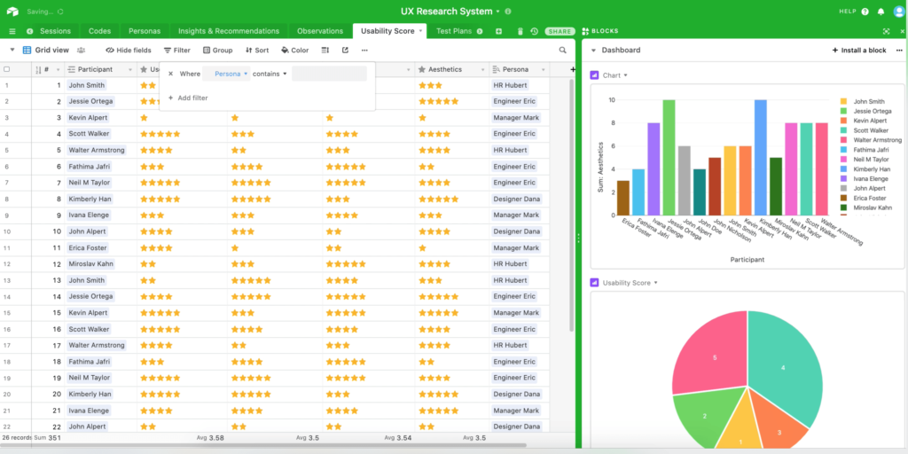
We ended up using Airtable to create our system given its deep capabilities, including unique field types, customizable views, and the ability to link data between tables. Compiling observations from user testing into a singular database, grouping them thematically, and creating different views depending on the end goal of the person viewing the data was easier than ever.
Ultimately, Airtable enabled us to take raw data and make it visible. We created a system for synthesizing research – hundreds of hours of interviews and insights – so that it could be used to tell a story about what the organization’s customers needed.
https://freshconsulting.wistia.com/medias/m1szo4dx5x
AirTable: “Seeing is Believing”
A well-told, data-supported story can be enough to convince even the most obstinate of stakeholders to take action, but convincingly arranging the plot points is a challenge when there’s so much research material to make sense of.
We took the “seeing is believing” philosophy, where insights from user research were presented as bite-sized, tangible, and accessible nuggets of information that the organization’s stakeholders could easily understand. These nuggets served as research vignettes: vivid, compelling examples of user pain points and desires.
Our primary motivation was to make sure that the user’s voice was never skewed and that it was represented in its purest form.
Stored snippets of transcripts, audio clips, and video clips served as the “voice of the user.” If a stakeholder needed an exact quote from a user – as if they were in the interview themselves – it was one click away. Each snippet of information was linked to a business goal, persona, product feature, or a design action item, making the data even more usable.
https://freshconsulting.wistia.com/medias/m6xgpq73ql
Directors were equipped with an easy-to-navigate dashboard to pull insights from when seeking buy-in. Stakeholders, Product Managers, and designers alike could finally understand the “why” behind the initiative, with everyone on the same page.
To enable stakeholders to track and differentiate insights based on user personas, we tagged and stored each participant’s information. Directors could obtain a high-level view or do a granular deep dive. We also solved the problem of organizing multiple rounds of user tests by tagging each insight to the session that surfaced it.
Points of View: A Multi-Dimensional Perspective on Data
Airtable’s variety of views made it easy to consume different pieces of information, such as the Gallery view (with powerful filters that made it easy to dig through insights) and the Kanban view (that organized data according to different codes/tags).
https://freshconsulting.wistia.com/medias/4cpizkusju
The Search lock feature made it easy to query multiple sources of information such as surveys conducted through Optimal Workshops, remote interviews, or moderated usability tests conducted with Validately.
“Views” make data visible and accessible in meaningful ways: with a quick pivot, stakeholders can see what happened in a different session at a glance, linking specific insights to sessions and users.
https://freshconsulting.wistia.com/medias/fl0sf2mffm
The Search lock feature made it easy to query multiple sources of information such as surveys conducted through Optimal Workshops, remote interviews, or moderated usability tests conducted with Validately.
“Views” make data visible and accessible in meaningful ways: with a quick pivot, stakeholders can see what happened in a different session at a glance, linking specific insights to sessions and users.
https://freshconsulting.wistia.com/medias/m6q8dvltiq
We were even able to auto-populate well-designed presentations. This made it easy to scan through the takeaways or print them for later reading. We added tags to track the status of insights, making sure those rendered obsolete over time weren’t surfaced but were still available for historical reference. We used 2×2 matrices to visualize insights across design tasks or personas.
https://freshconsulting.wistia.com/medias/ngmc8we86j
Creating a Single Source of Truth
The most powerful capability was that directors could link pieces of information together and easily pivot between them. Seeing the same information in different ways enriches perspective – in this organization’s case, it helped them derive strategic insights that would otherwise have been lost in a sea of unusable data. But for stakeholders who wanted to review the actual transcripts, they were stored and easily searchable.
Our solution – one source of truth for all product insights – provided both a high-level summary and the ability to easily view granular information/. The added work for such thorough documentation might sound intimidating, but we measured that it took less than 10 hours extra to compile everything.
https://freshconsulting.wistia.com/medias/bcp8n77bnv
Fresh Process, Fresh Insights
Our partnership changed the way the organization looked at their product and led to a larger strategic initiative that would help deliver more value to their clients. Each time there was a conversation around a product decision, the team can pull up insights in real-time and guide conversations.
Fresh’s researchers have started to become more streamlined in how we estimate our research efforts, design interviews, create test plans, and document insights, and it’s thanks in large part to the capabilities provided by Airtable. Now that we can frame data in a tangible, accessible, and usable way, we can provide that same service to our clients.


