Microchip Technology
Microchip Graphics Composer
A graphical user interface design tool that simplifies the development of embedded systems interfaces
Background
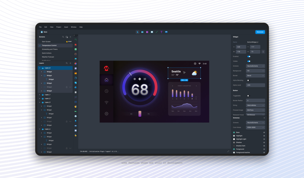
Microchip is a leading provider of smart, connected and secure device solutions. As part of their development suite, they offer a GUI design tool that allows anyone to create branded user interfaces for smart devices without complex coding.
Graphics Composer handles all configuration requirements as well as generates any source code needed for professional looking GUIs – considerably reducing the effort needed to deploy apps to smart devices.
Challenges
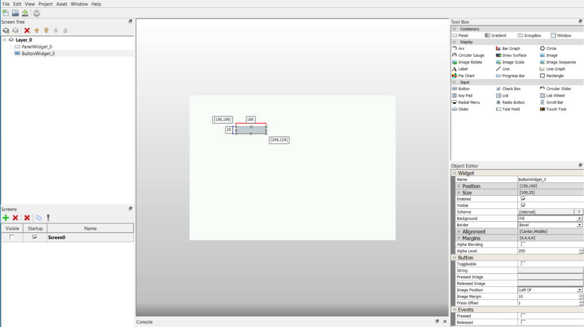
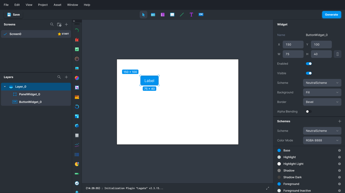
Although Graphics Composer simplifies the complex task of creating visually appealing interfaces, the tool needed a significant update as its visual design resembled outdated applications and lacked the modern, highly-usable characteristics of today’s software.
The new application design needed to cater to two distinct user groups: UI designers, providing the typical tools of graphic design software, and Firmware Engineers, who needed a highly functional tool to debug and develop the code behind the UI.
Services & Capabilities
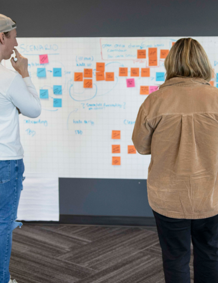
Aligning on a vision for a new style
To kick off the project, Fresh led a design workshop with the Microchip team to align on a shared vision for the product. The team would later apply those learnings to design the new Graphics Composer app UI, and define a style guide.
In the workshop the team was able to translate words into visual direction, define the baseline standards for the new design, and identify things to avoid. Having concrete scope and desired visual aesthetics, the team had a clear path forward for the upcoming wireframe and style exploration phases.
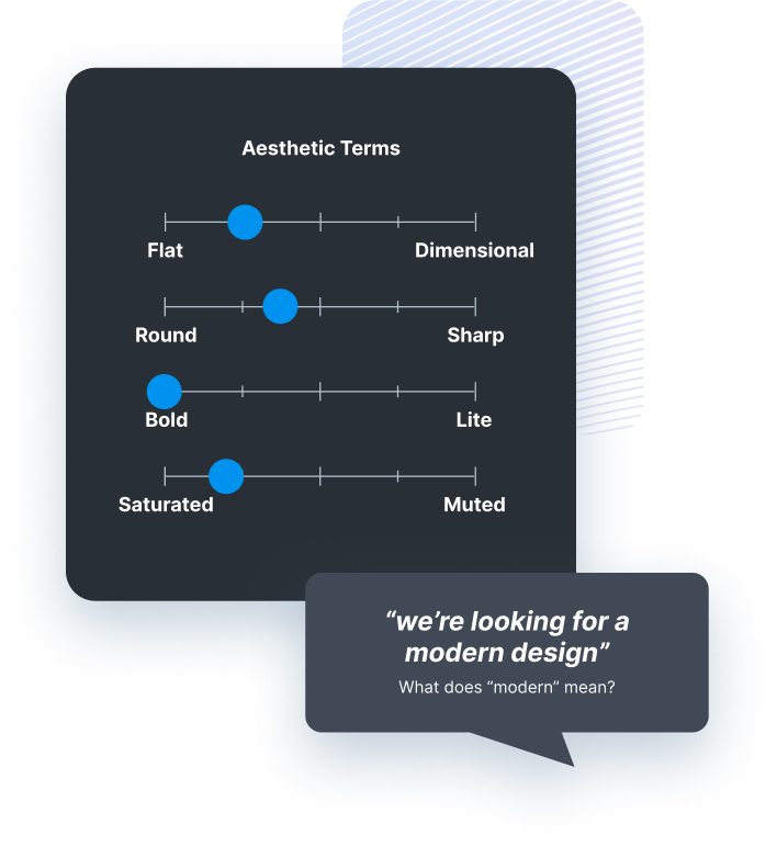
Defining aesthetic style
During the workshop, we conducted exercises with the team to establish a unified understanding of what “modern” entails in terms of aesthetic style. These exercises helped align team members’ perceptions, language and preferences regarding contemporary design trends that informed our design direction.
We also conducted exercises to identify our competitors and determine who we need to surpass, emulate, or aspire to. We discussed and examined the competitive landscape to understand industry benchmarks and market leaders which helped us clarify our strategic direction and objectives.
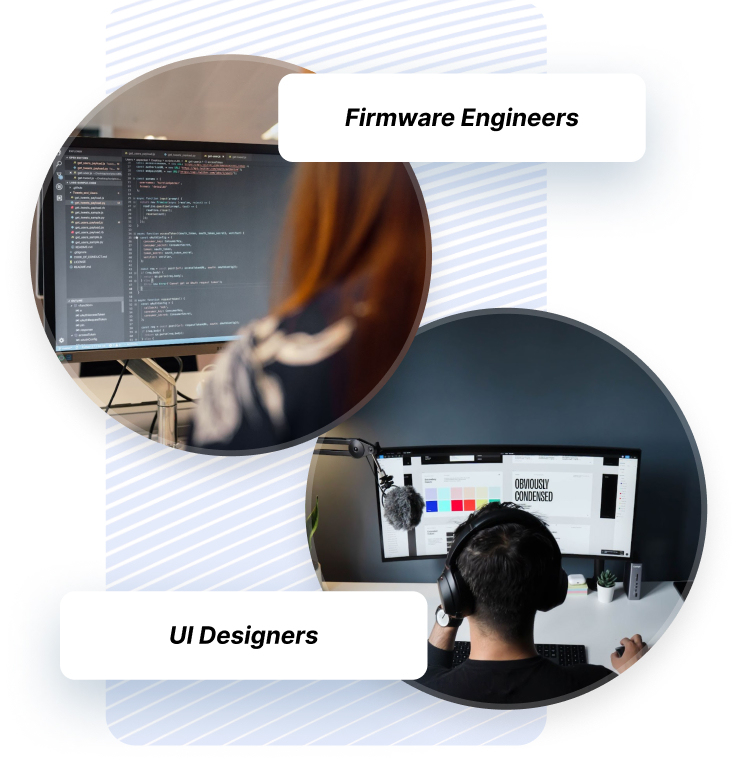
Listening to the users
We conducted user interviews with UI designers and firmware engineers to understand their needs and usage of our app. From UI designers, we learned about essential features and areas for improvement to enhance creativity. Engineers provided insights into technical requirements and collaboration challenges.
These interviews helped us identify and gain a comprehensive understanding of each persona’s needs, guiding future improvements for the app.


Improving the layout before redesigning
Before diving into the redesign process, we took the opportunity to analyze and enhance the layout and usability of the app. This pre-redesign phase allowed us to critically evaluate the existing interface, identifying areas for improvement.
We gathered feedback from users to solicit pain points and areas of confusion within the app. Through this process, we identified opportunities to streamline navigation, simplify workflows, and improve overall user experience.

New simplified layout with less screen sections.
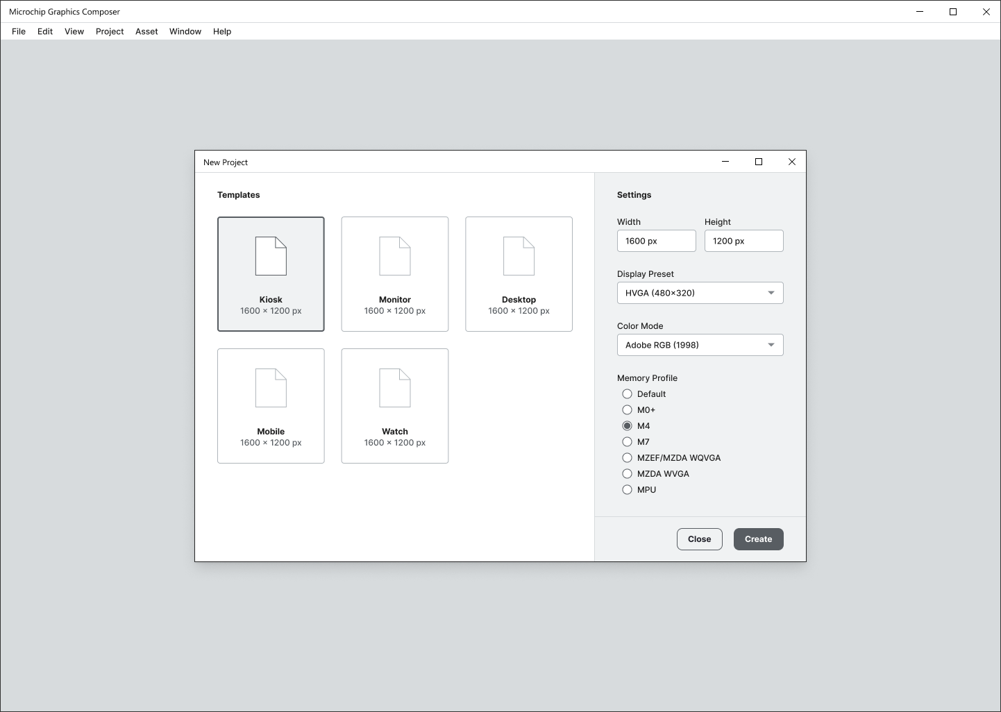
New layout for the start new project screen, reduced to one step.
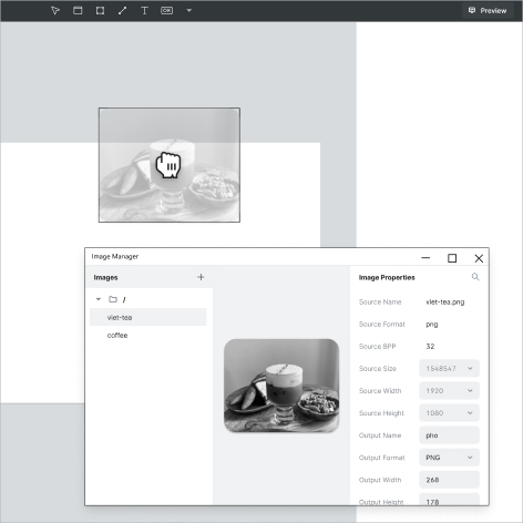
An improved asset import flow
A key part of the designer workflow is adding external assets to their projects.
Simplifying and improving the process of importing assets such as images and fonts directly impacts the productivity of designers and developers.
By reducing the time and effort required to import assets, designers can focus more on creativity, ultimately leading to faster project turnaround times and higher quality designs.

Exploring options for the toolbox
Assessing the toolbox’s placement and layout was vital for optimizing user interaction and workflow efficiency. The toolbox’s position directly influences ease of access to essential tools, impacting productivity.
By reevaluating its layout, we aimed to streamline navigation and ensure intuitive tool accessibility. A well-designed toolbox enhances productivity and contributes to a cohesive interface design.


Improved icons
Updated icons with a modern vector style design, along with vibrant colors and improved visual clarity, added visual appeal and energy to the UI.
To improve the look and feel of the icons, first the fresh team transitioned from raster based icons to vector style, which allows for scalability without pixelation.
Then the team experimented with different styles such as outline vs. filled. Finally, we tested different color schemes to find one that works well with both light and dark interfaces.
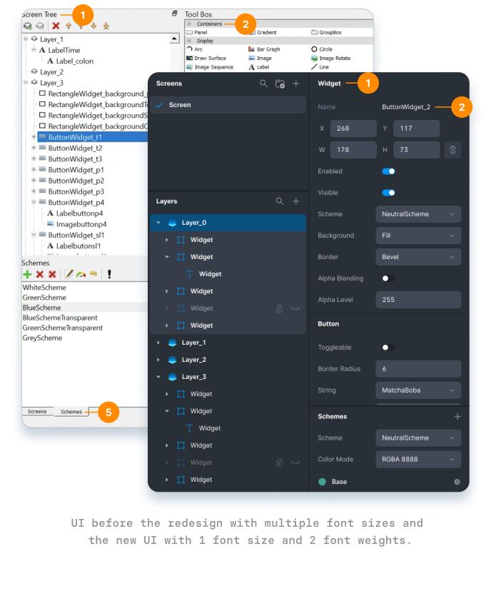
Consolidated the typographic sizes, weights and overall visual hierarchy
The current design has a large variety of font weights and sizes, many of them differing between panels. This creates an unclear sense of visual hierarchy.
We reduced the number of typographic variations to one font size and only two weights. This unifies the design without sacrificing clear hierarchy between the elements.
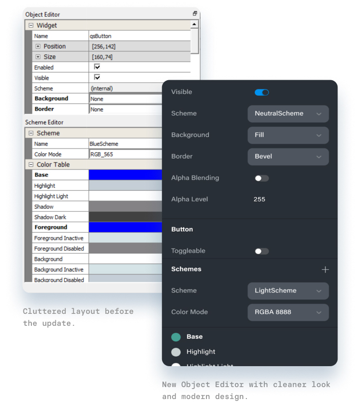
Simplified Object Editor: Cleaner look and contemporary controls
We redesigned the object editor section for a cleaner look by removing divider lines, reducing the color swatches and increasing the label text font size and line height.
The updated design allows for easier scanning of the parameters and faster parameter identification, improving the form usability and user productivity.


Testing the designs
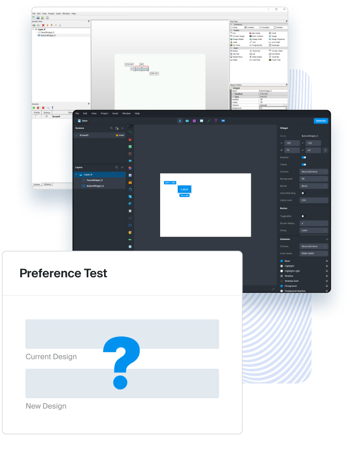
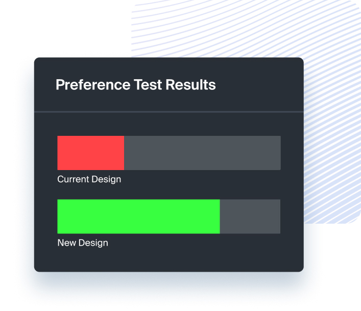
In an effort to assess the impact of the new designs, Fresh ran a preference test in which IT professionals such as UI designers and developers were asked to select between the old and new design, and which product they would be more inclined to pay for and trust.
Participants were also asked to rank the designs on visual appeal and to provide an explanation for the rating given.
Before & After
The Results
The new design scored 73% over the previous design in a preference test. The substantial difference and feedback collected demonstrates that the new design is perceived as more appealing, trustworthy and valuable compared to the previous design.
“I really appreciate working with you and your teams. Fresh has significantly outperformed my expectations in project execution: you have been fantastic in communication, quality and frequency of deliverables, scoping of work, staying on budget, and staying on schedule. I look forward to trying to kick off a few additional projects with you as soon as possible!


