Article
How to Create Engaging Content: 6 Tips

August 2, 2013 ...

“Content precedes design. Design in the absence of content is not design, it’s decoration.” Jeffrey Zeldman
In a knowledge-based economy, engaging content is the currency of productivity. Information, ideas, and design create value.
UI/UX design begins with content as the foundation because it drives the purpose of all other functionality, input, and navigation. Compelling content engages users, which invites further exploration.
6 Tips for Engaging Content
Fresh Consulting’s UI Design Framework evaluates criteria for website usability. This post addresses 6 attributes of engaging content:
1. Organized Content
“An agenda programs the reader’s mind to more efficiently receive the message.” Bill Baker, Professor of Management Communication, Brigham Young University
Use an agenda near the top to help users understand what is coming. A top navigation bar helps users understand the site’s structure, and an agenda communicates the content’s structure.
Headings and titles play a significant role in organizing content. Users can often understand an organization scheme with nothing more than a well-written page title. Blog posts can benefit from a preview paragraph at the top.
Show People What’s Ahead
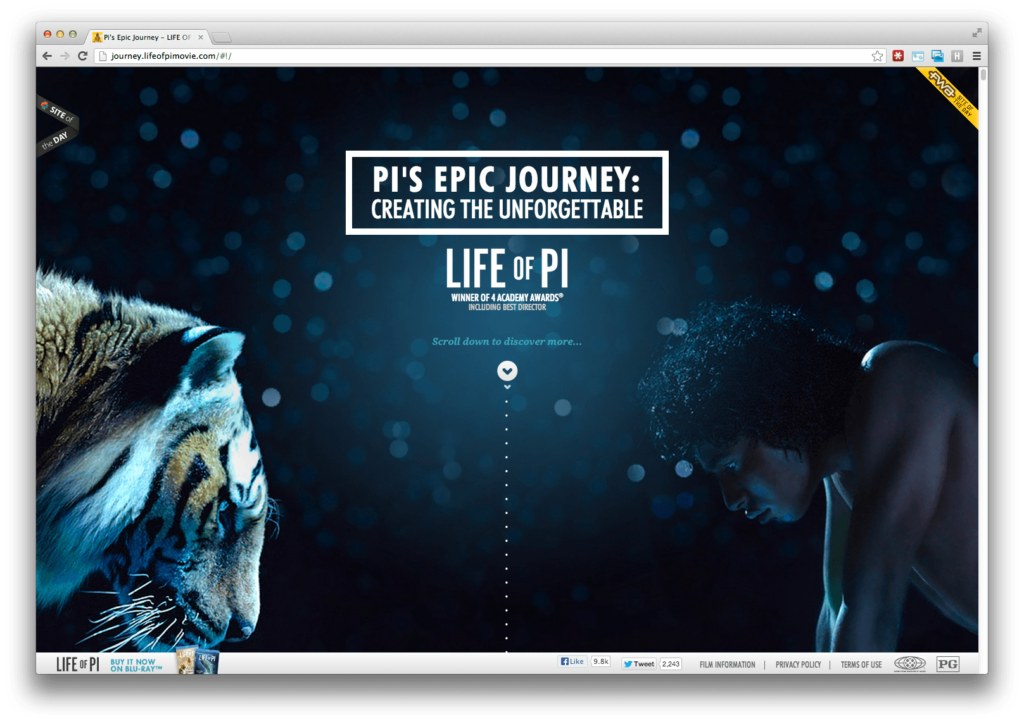
The same idea is applicable to visual content. Images above the fold can communicate what’s in store on the rest of the page. For example, a promotional page for the Life of Pi film welcomes users with the image of a tiger and a man looking down toward the bottom of the screen. This visual cue reveals the vertical structure.
Chaotic content is difficult to understand, so create order for both written and visual content. Steve Krug said “people won’t use your Web site if they can’t find their way around it.” The same holds true for content.
How to Create Organized Content
- Guide users with intuitive page names and headings
- Use an agenda paragraph or list for written content
- Prominent visual content should show where the page leads
2. Compelling Content
“Many designers create wireframes and comps with “lorem ipsum” filler text. Using dummy text often results in an aesthetically pleasing but unrealistic design. What’s worse, it creates the illusion that content is secondary.” (UX Myths)
The art of creating compelling content is a joint effort directed by designers and writers.
Writing for the Specific Format
Writers should be aware of how their words will be presented. Stories are told differently on a homepage compared with a landing page or microsite. And content that might be compelling through the written word could flop in a video or an infographic. When the writer understands the objective from the beginning, the message can be crafted to match the medium.
Design Enhances Content
Design is about creating order from chaos. Designers should understand the content’s premise before executing. Using visual elements that resonate with the content boosts usability. The example below illustrates how typography, color, and layout make the content more compelling.
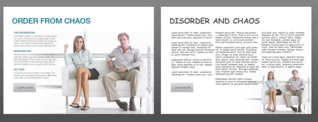
Content creation is a joint effort between designers and writers. Typography, color, and layout enhance content.
How to Create Compelling Content
- Plan the content before executing other UI/UX elements
- Craft the content to match the medium
3. Relevant Content
“One of the most dangerous elements in any design is imagery that conveys the wrong message, causes confusion or leaves the user with a sense of shallow fakery.” (52 Weeks of UX)
Real trumps flawless. Sometimes organic content is more attractive to users because it is full of the rich details lost in a sterile studio environment. Users recognize this, and it can impact usability. Jakob Nielsen’s eyetracking study confirms that “users pay close attention to photos and other images that contain relevant information but ignore fluffy pictures used to ‘jazz up’ Web pages.”
Stock Content
Many projects don’t have the budget to engage a professional photographer. Using licensed content like Graphic River or Getty Images can be a quick and simple way to incorporate quality visual content. However, any use of stock content should be deliberate and in line with the site’s message. A sloppy selection can leave a bad impression and erode the site’s usability.
Add Organic Material
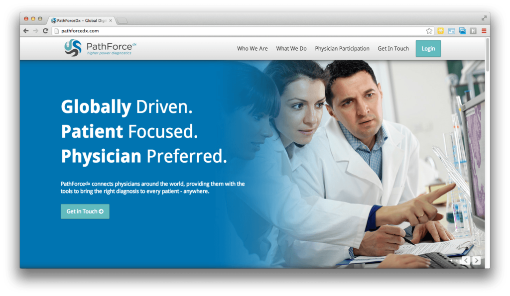
Consider how to incorporate organic content. The marketing page for PathForceDx shows that doctors can see a very high-resolution slide on a computer screen without needing a microscope. A real purple-stained cell slide was combined with a carefully-selected photo of physicians looking at a screen. This visually communicates the key message.
Create Entry Points to the Page
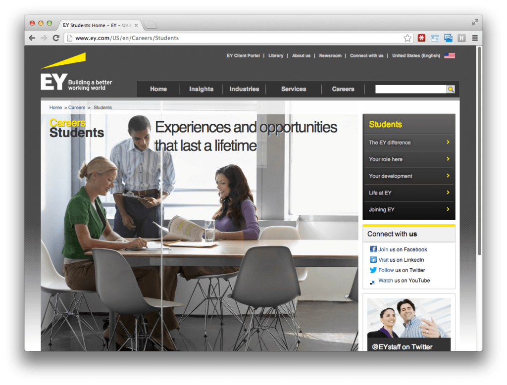
Visuals can serve as an entry point to the page. An ambiguous image makes the content less accessible because users expect contextual clues. The EY career page uses a studio image of three people working in a conference room. The photo looks good and works well with the page’s visual design, but it does little to communicate the page’s message. A professional, organic photo of students embracing unique opportunities would communicate subtle nuances specific to EY.
How to Create Relevant Content
- Avoid filler material soley for the sake of polishing or expanding the content
- Sometimes minor, organic blemishes add depth and increase impact
- All stock content should be deliberately chosen to communicate your message (not just look pretty)
4. Chunky Content
“People only read word-by-word on the web when they are really interested in the content. They usually skim the pages looking for highlighted keywords, meaningful headings, short paragraphs and scannable list. Since they’re in a hurry to find the very piece of information they’re looking for, they’ll skip what’s irrelevant for them.” (UX Myths)
Just like peanut butter, I like my content chunky.
Chunking content means grouping related information together. This can include text, lists, images, and white space. Users look for ways to break down content into manageable bites. Sometimes this increases the page length, but it decreases the time it takes to read.
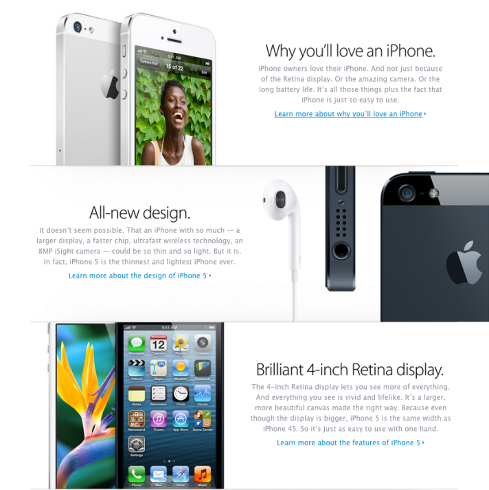
To facilitate skimming, take advantage of headings, bullet points, and above all negative space. Apple is notorious for bundling related ideas into sections separated by white space.
How to Create Chunky Content
- Group related content
- Use plenty of negative space
- Use headings, with multiple levels if necessary
- Use bullet/numbered format for lists
5. Readable Content
“When your content is highly readable, your audience is able to quickly digest the information you share with them — a worthy goal to have for your website, whether you run a blog, an e-store or your company’s domain.” Mashable
Write so anyone can understand quickly. No one should have to read a sentence twice. This expands your audience base, and helps everyone digest content quickly.
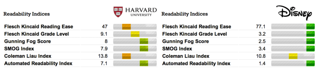
In general, readability increases by using smaller words, shorter sentences, and liberal paragraph breaks. For example, the Flesch Kincaid Reading Ease score looks at 2 factors: 1) words per sentence and 2) syllables per word.
Using familiar words and phrases helps people scan paragraphs quickly. Match the voice and tone with the audience. Readability means something different for the Harvard Law Review than it does for Disney.
Speaking to the Intended Audience – Harvard vs Disney
How to Create Readable Content
- Use simple words that pack a punch
- Break down long sentences into smaller ideas
- Use short paragraphs to show related content
- Match your voice to the intended audience
6. Concise Content
“Make it as simple as possible, but not simpler.” (Albert Einstein)
If you can say it with 10 words, don’t use 15.
Further Content about Engaging Content:
Compelling Content
UX Myths – You Don’t Need the Content to Design a Website (Myth)
UX Booth – Complete Beginners Guide to Content Strategy
52 Weeks of UX – The Long and Short of Writing for the Web
Copy Blogger – 22 Ways to Create Content (Infographic)
Original Content
52 Weeks of UX – A Picture is Worth 1,000 Words, Except When It Isn’t
Mashable – Magnetic Content
Nielsen Normal Group – Weblog Usability Top Ten Mistakes
Chunky Content
UX Myths – People Read on the Web (Myth)
Organizing Content
KISSmetrics – 9 Steps to Write Your Ultimate Home Page Headline
37 Signals – Copywriting is Interface Design
Readability
UX Booth – Design for Readability