Navia Benefit Solutions
Secure, seamless claims management
We designed a claims management app, prioritizing user experience and security
The Challenge
Navia had an application, but it wasn’t performing up to their rigorous standards. The claims management process was more complicated than it needed to be, defeating the purpose of having an app to begin with. Our challenge was finding the nexus between Navia’s business needs, the behaviors of the end-user, and the positioning of their brand to create an application that delivered on all fronts.
Our Solution
Understanding that user experience is the sum of multiple parts, we set out to reimagine Navia’s visuals, the app’s user flow, the end-user’s demand for security, and the need to convey complex information with iconography and when possible. From user research to explorations of UI, we completed an end-to-end reimagining of Navia’s claims management app.


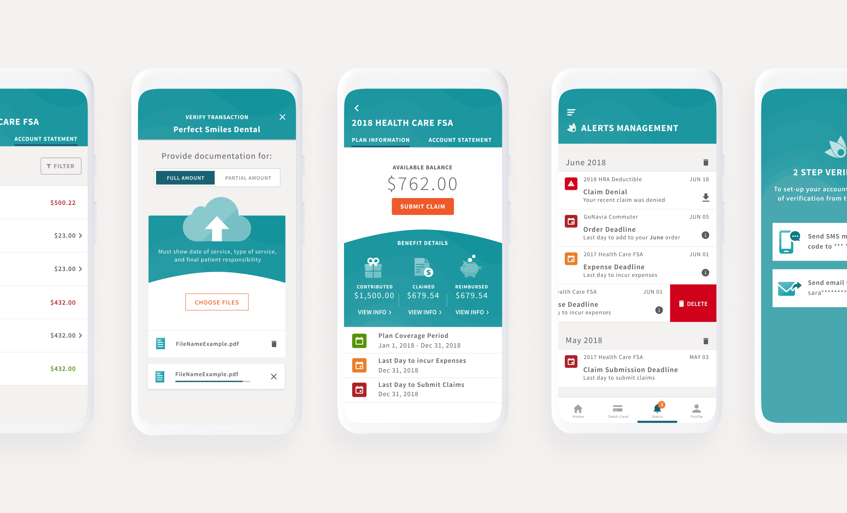
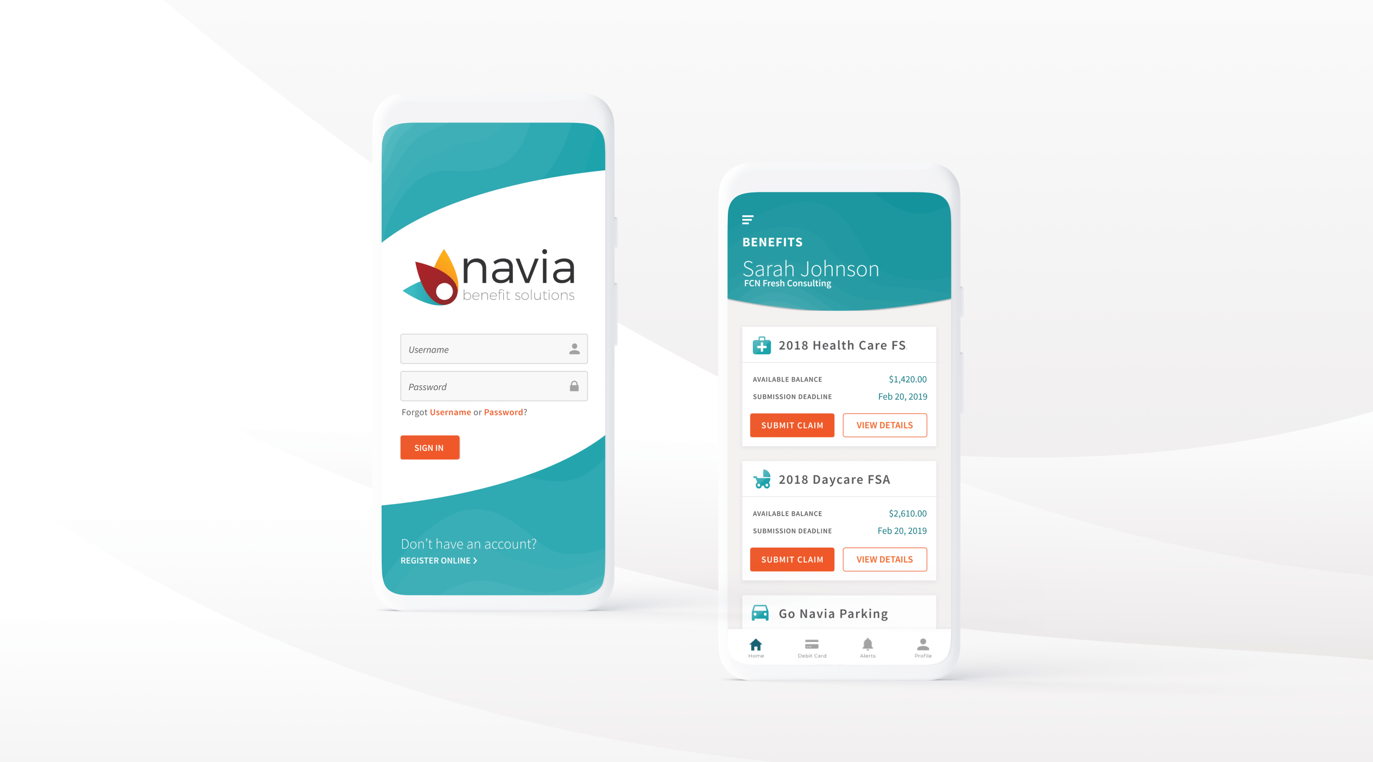
Designed with ease in mind
With a claims information app, there is an overabundance of information. But the challenge is that all of the information is necessary. We thought critically about how to use color, spacing, and iconography to strategically draw the user’s attention.
Strategically placed buttons and links decrease the user’s cognitive load, allowing them to accomplish multiple key actions from the same screen as opposed to navigating deeper into the app in order to find what they need. Each screen of the UI is a hub: packed into a small space are all essential controls to put users in the driver’s seat while reviewing and submitting claims.


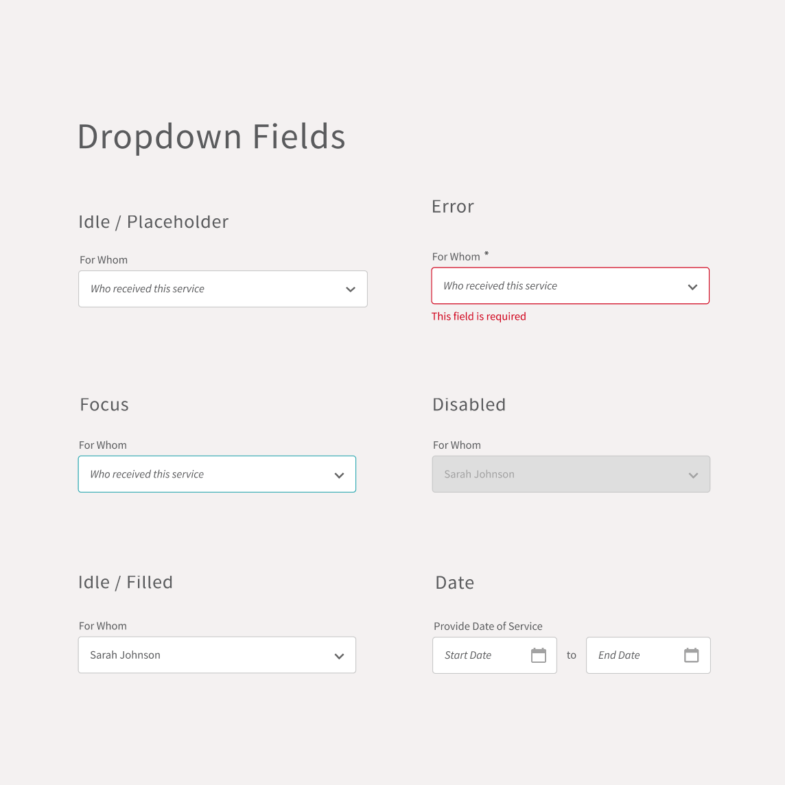
Consistency in the details
We recognized the need for consistent styling across all user touchpoints within the app, from the treatment of text to the visual weight of icons. We created a style guide for visual transformation. Whenever a new designer comes onto the app to make adjustments or updates, they have a guidebook for what buttons should look like, how they should be implemented, and how to do so. The details we included in the handoff were consistent, but we also provided a tool to make sure that any future details will adhere to a uniform, strategically implemented style.


Eliminating fine print
Claims management is complex. But the way we explain it doesn’t need to be.
From the outset, we recognized the need for clear instructions that help users through a step-by-step process. We drew from psychological principles about form completion and progress, ensuring that using the app feels logical rather than cumbersome.

Increasing security with simple sign-on
At Fresh, we’ve done extensive work in biometric authentication, and we applied our existing knowledge-base to the Navia app. Users aren’t required to activate fingerprint ID, but it’s an option.
However users choose to sign in, they can do so with ease. They can also rest assured that the app prizes securing and protecting personal information, which is especially important with something as personal as claims management.

