Latitude Kitchen & Bar
Elevating a restaurant’s brand

We helped a restaurant rebrand, nodding to history and meeting the future with confidence
The Challenge
Latitude Kitchen & Bar was interested in a comprehensive rebranding effort to support their new physical restaurant expansion and style evolution. The challenge for Fresh strategists and designers rested in ensuring that the revamped visual brand language adhered to Latitude’s history as a beloved Pacific Northwest restaurant while also lending credibility to food and customer service quality.
Our Solution
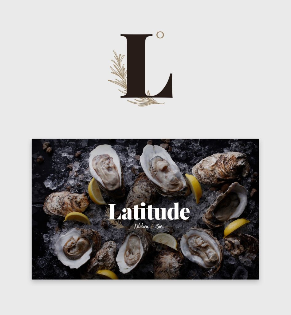
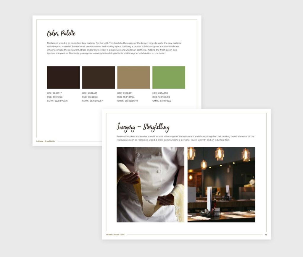
Fresh updated Latitude’s visual brand with a nautical style, nodding to the Pacific Northwest and locally sourced seafood that the restaurant serves. We incorporated reclaimed wood and brass elements in the physical style to reference Latitude’s history while adding sage to reinforce the fresh ingredients that define their menu. The result was a cohesive brand experience: elements of the restaurant’s history matched with aesthetic elements that communicate their novel, elegant, and high-quality restaurant experience.


Pairing visual and experiential brand elements
A key component of what defines Latitude is sitting in the restaurant itself. While signage and advertisements are essential, nothing beats the feeling of pulling up a chair and enjoying a meal in their unique setting.
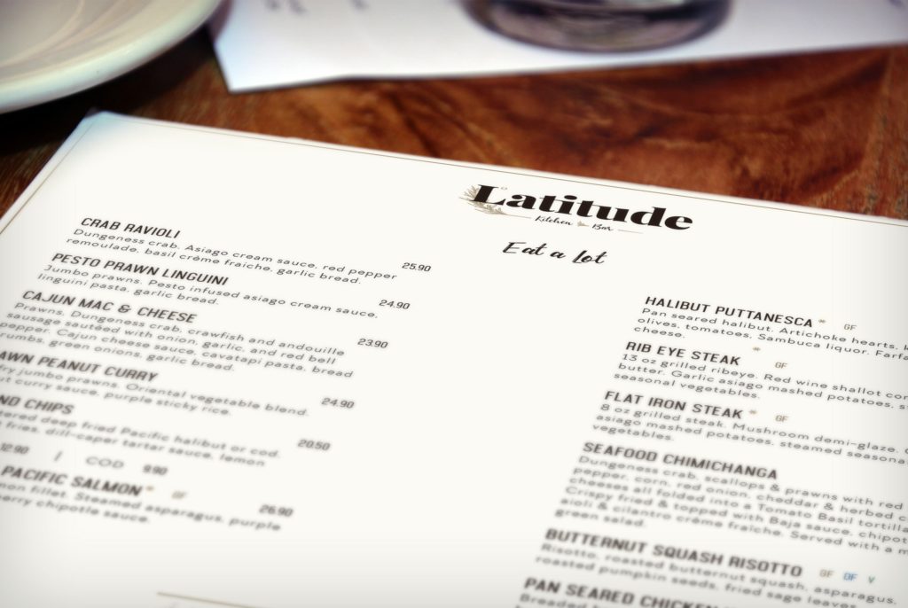
The restaurant's physical space was remodeled, with reclaimed wood and brass elements that paid homage to history while increasing their profile. We borrowed these ideas for creating branded collateral. Brown and bronze tones form the foundation of the letterhead and business cards, while a lively green brings visual exhilaration and highlights the high-quality ingredients that define the menu.


